
Jersey Mockups


But the elegance in the current jersey is in the simplicity...Greg M
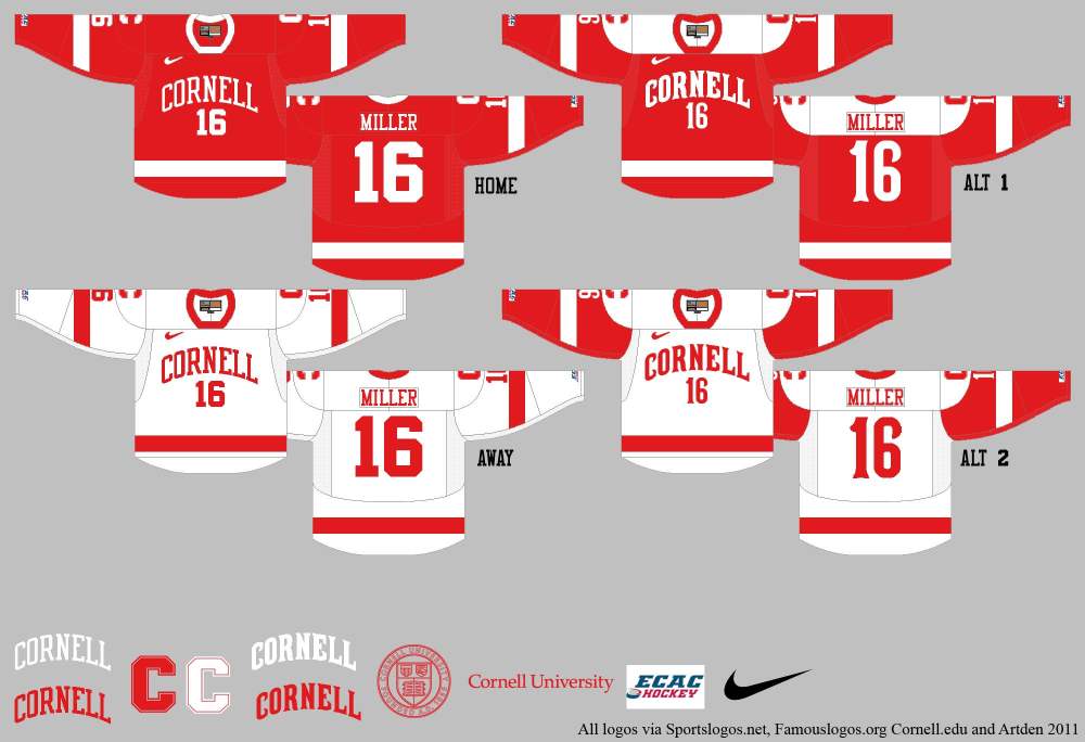
Since I should be doing a math problem set and studying for finals, I decided I wasn't a big fan of the current jerseys and did a mockup of a new scheme. There's some things I would like to play with and improve, but I can do that after math
On the other hand, NO.
03/23/02: Maine 4, Harvard 3
03/28/03: BU 6, Harvard 4
03/26/04: Maine 5, Harvard 4
03/26/05: UNH 3, Harvard 2
03/25/06: Maine 6, Harvard 1
Greg M
They're too bland for my taste, personally, and to be honest, the tradition doesn't really mean anything to me. As my friend said the other day... "It's not like there's anything wrong with them, it's just that I always like the other team's jerseys better."
Which other team? Most college jerseys seem to have the team name in the team colors, and the ones that don't like Clarkson's Harley alternate look horrible.
03/23/02: Maine 4, Harvard 3
03/28/03: BU 6, Harvard 4
03/26/04: Maine 5, Harvard 4
03/26/05: UNH 3, Harvard 2
03/25/06: Maine 6, Harvard 1
But I've seen what happens when teams start messing with their traditional colors and design. Jersey designers will eventually have us wearing crimson.
Do we really want to look like Quinnipiac? I have always thought our jerseys (especially the away Red's) are among the best in the country.Greg M
They're too bland for my taste, personally, and to be honest, the tradition doesn't really mean anything to me. As my friend said the other day... "It's not like there's anything wrong with them, it's just that I always like the other team's jerseys better."
Messing with the jerseys is what a mediocre team does because it has to put asses in the seats, and it can't do that with on-ice performance.
I personally like that there have been few, if any, changes over the years. It reflects pride in the tradition; generations of Cornell hockey players have warn the same hockey sweaters.
Exactly right. Please, no black. It's almost gone from the football jerseys, so let's not introduce it on the hockey sweaters.dag14
Did you notice BU's jerseys? They haven't changed since I started watching them play in the 70's. And they happen to be almost identical to ours. And the Detroit Red Wings'.
I personally like that there have been few, if any, changes over the years. It reflects pride in the tradition; generations of Cornell hockey players have warn the same hockey sweaters.
Al DeFlorio '65
Look at the sweaters worn by some of the more prestigious and historical programs in collegiate hockey. They all resemble one another in their adherence to simplicity.
[url=
]
"Yo Paulie - I don't see no crowd gathering 'round you neither."
Agree, my wife wanted to make me a stained glass bear, and I insisted on the "skeptical".captens1
I still mourn the changeover from skeptical bear to huggy bear. Skeptical seems so much more appropriate for an academic institution.
"Cornell Fans Made the Timbers Tremble", Boston Globe, March/1970
Cornell lawyers stopped the candy throwing. Jan/2005
"Yo Paulie - I don't see no crowd gathering 'round you neither."
No, she has enough problems with presents for family.TimV
Will she do commission work?

"Cornell Fans Made the Timbers Tremble", Boston Globe, March/1970
Cornell lawyers stopped the candy throwing. Jan/2005
OTOH, I didn't mind when they put skeptical bear on the shoulders in the mid-80's.

Towerroad
As long as we are talking about things that will never happen how about going old school with the jersey
If you want things that will never happen, why not an outdoor game?
jtn27
If you want things that will never happen, why not an outdoor game?
We'll probably play an outdoor game eventually. An outdoor game on Beebe Lake will never happen again. Which is sad because it would be amazing.
Probably, but huggy bear is loathsome -- the graphic artist may have actually intended it as a bad joke.Kyle Rose
Smug bear is not coming back
If they must have the "I Love the 90's" action figure breaking the fourth wall so that they can market a line of kids toys, or whatever they were thinking, we have enough talented people in the Art & Arch school to come up with the synthesis: Huggy Skeptical Bear!
Ben
jtn27
If you want things that will never happen, why not an outdoor game?
We'll probably play an outdoor game eventually. An outdoor game on Beebe Lake will never happen again. Which is sad because it would be amazing.
How about Schoellkoph?
Towerroad
Ben
jtn27
If you want things that will never happen, why not an outdoor game?
We'll probably play an outdoor game eventually. An outdoor game on Beebe Lake will never happen again. Which is sad because it would be amazing.
How about Schoellkoph?
I believe I said in another thread that I'd like us to play Harvard (or both games of Harvard/Dartmouth weekend) at Schoellkopf eventually. But playing on Beebe Lake would far cooler.
I'd rather play a big time OOC foe at Schoellkopf. Go for as big a spectacle as possible to draw as many fans as possible. Something like Michigan or Wisconsin. If you want to make it so their fans could travel in as well BC might work nicely.Ben
Towerroad
Ben
jtn27
If you want things that will never happen, why not an outdoor game?
We'll probably play an outdoor game eventually. An outdoor game on Beebe Lake will never happen again. Which is sad because it would be amazing.
How about Schoellkoph?
I believe I said in another thread that I'd like us to play Harvard (or both games of Harvard/Dartmouth weekend) at Schoellkopf eventually. But playing on Beebe Lake would far cooler.
Ben
Towerroad
Ben
jtn27
If you want things that will never happen, why not an outdoor game?
We'll probably play an outdoor game eventually. An outdoor game on Beebe Lake will never happen again. Which is sad because it would be amazing.
How about Schoellkoph?
I believe I said in another thread that I'd like us to play Harvard (or both games of Harvard/Dartmouth weekend) at Schoellkopf eventually. But playing on Beebe Lake would far cooler.
I really don't like this idea. Outdoor hockey puts the fans really, really far from the action. The fun of Lynah is that you're close to the ice.
Very true, I think I support it mainly because the players here want to do it, and therefore it could be a really great recruiting tool to do once every 5 years or so. But Lynah is a great recruiting tool in itself. Besides, at true spectacle of an event might almost fill Schoellkopf which would be pretty cool. [url=Dafatone
Ben
Towerroad
Ben
jtn27
If you want things that will never happen, why not an outdoor game?
We'll probably play an outdoor game eventually. An outdoor game on Beebe Lake will never happen again. Which is sad because it would be amazing.
How about Schoellkoph?
I believe I said in another thread that I'd like us to play Harvard (or both games of Harvard/Dartmouth weekend) at Schoellkopf eventually. But playing on Beebe Lake would far cooler.
I really don't like this idea. Outdoor hockey puts the fans really, really far from the action. The fun of Lynah is that you're close to the ice.
]Andy Iles[/url] [url=Would love to experience an outdoor game. Can't imagine the atmosphere at the big house last year. What do you say faithful? #lynahfaithful
— Andy Iles (@A_Iles33) August 27, 2011
]Nick D'Agostino[/url] Gotta give the players what they want right?about 4 more outdoor college hockey games this year and none include the Big Red...when are the best fans in the nation gonna be rewarded???
— Nick D'Agostino (@DAGwood6) August 26, 2011
They should put the rink right next to the Crescent and add moveable bleachers rinkside on the west edge. I think that would work.Dafatone
Ben
Towerroad
Ben
jtn27
If you want things that will never happen, why not an outdoor game?
We'll probably play an outdoor game eventually. An outdoor game on Beebe Lake will never happen again. Which is sad because it would be amazing.
How about Schoellkoph?
I believe I said in another thread that I'd like us to play Harvard (or both games of Harvard/Dartmouth weekend) at Schoellkopf eventually. But playing on Beebe Lake would far cooler.
I really don't like this idea. Outdoor hockey puts the fans really, really far from the action. The fun of Lynah is that you're close to the ice.
css228
Very true, I think I support it mainly because the players here want to do it, and therefore it could be a really great recruiting tool to do once every 5 years or so. But Lynah is a great recruiting tool in itself. Besides, at true spectacle of an event might almost fill Schoellkopf which would be pretty cool. [url=Dafatone
Ben
Towerroad
Ben
jtn27
If you want things that will never happen, why not an outdoor game?
We'll probably play an outdoor game eventually. An outdoor game on Beebe Lake will never happen again. Which is sad because it would be amazing.
How about Schoellkoph?
I believe I said in another thread that I'd like us to play Harvard (or both games of Harvard/Dartmouth weekend) at Schoellkopf eventually. But playing on Beebe Lake would far cooler.
I really don't like this idea. Outdoor hockey puts the fans really, really far from the action. The fun of Lynah is that you're close to the ice.]Andy Iles[/url] [url=Would love to experience an outdoor game. Can't imagine the atmosphere at the big house last year. What do you say faithful? #lynahfaithful
— Andy Iles (@A_Iles33) August 27, 2011]Nick D'Agostino[/url] Gotta give the players what they want right?[/quote]about 4 more outdoor college hockey games this year and none include the Big Red...when are the best fans in the nation gonna be rewarded???
— Nick D'Agostino (@DAGwood6) August 26, 2011
It could be pretty cool. I just wouldn't want to see it done for the Harvard game, given how big a tradition it is. Maybe an out of conference matchup would work.
Trotsky
Probably, but huggy bear is loathsome -- the graphic artist may have actually intended it as a bad joke.Kyle Rose
Smug bear is not coming back
And as I've said before, it doesn't even conjure up "huggy" for me - it screams "Help, I'm stuck in this vise!!"
Only one of many reasons why skeptical bear is still among my favorite Cornell lapel pins.
Beeeej, Esq.
"Cornell isn't an organization. It's a loose affiliation of independent fiefdoms united by a common hockey team."
- Steve Worona
1. Though I don't love a few of the designs in this particularly jersey, it would be nice to do something like this and then auction off the jersey for charity - similar to the breast cancer pink jerseys. I think something a bit more "cartoonish" like this jersey would have some appeal and could raise cash for a good cause. Hopefully that cause is hiring the RPI crew to do live streaming video for the games.
2. I always thought of "Huggy Bear" as "Bear Angry that he got stuck in a "C" trap"
Alex
I do love Grumpy (skeptical) Bear.
Dafatone
css228
Very true, I think I support it mainly because the players here want to do it, and therefore it could be a really great recruiting tool to do once every 5 years or so. But Lynah is a great recruiting tool in itself. Besides, at true spectacle of an event might almost fill Schoellkopf which would be pretty cool. [url=Dafatone
Ben
Towerroad
Ben
jtn27
If you want things that will never happen, why not an outdoor game?
We'll probably play an outdoor game eventually. An outdoor game on Beebe Lake will never happen again. Which is sad because it would be amazing.
How about Schoellkoph?
I believe I said in another thread that I'd like us to play Harvard (or both games of Harvard/Dartmouth weekend) at Schoellkopf eventually. But playing on Beebe Lake would far cooler.
I really don't like this idea. Outdoor hockey puts the fans really, really far from the action. The fun of Lynah is that you're close to the ice.]Andy Iles[/url] [url=Would love to experience an outdoor game. Can't imagine the atmosphere at the big house last year. What do you say faithful? #lynahfaithful
— Andy Iles (@A_Iles33) August 27, 2011]Nick D'Agostino[/url] Gotta give the players what they want right?[/quote]about 4 more outdoor college hockey games this year and none include the Big Red...when are the best fans in the nation gonna be rewarded???
— Nick D'Agostino (@DAGwood6) August 26, 2011
It could be pretty cool. I just wouldn't want to see it done for the Harvard game, given how big a tradition it is. Maybe an out of conference matchup would work.[/quote]
Could be a lure for one of the Western schools. I agree that Sucks does not deserve the opportunity.
My wife calls it "Reach Around Bear."sockralex
2. I always thought of "Huggy Bear" as "Bear Angry that he got stuck in a "C" trap"
That's more than Disinterested Bear ever did. Selfish.Trotsky
My wife calls it "Reach Around Bear."sockralex
2. I always thought of "Huggy Bear" as "Bear Angry that he got stuck in a "C" trap"
quality tweets | bluesky (twitter 2) | ALAB Series podcast | Other podcasts and writing
If we can get a weekend of Wisconsin and Michigan, that would be awesome. But we know that we'll play Harvard and Dartmouth every year, and that is usually the most hyped weekend of the season (and would be the most likely pairing to fill the Crescent).Towerroad
Could be a lure for one of the Western schools. I agree that Sucks does not deserve the opportunity.
And if we lose to Wisconsin, I would have to hide from the rest of my family.
Greg M
They're too bland for my taste, personally, and to be honest, the tradition doesn't really mean anything to me. As my friend said the other day... "It's not like there's anything wrong with them, it's just that I always like the other team's jerseys better."
You're not going to get far in a presentation proposing a major change to this program by saying "tradition doesn't really mean anything to me."
")
Personally, I love our current jerseys (except I think the white stripe on the roads shouldn't be at the bottom hem like they are this season) and think they're about as classic a look as you can get. But I'll humor Greg M, since he spent his procrastination-for-Finals time on a hockey-specific project. Otherwise, I echo French Rage's statement.
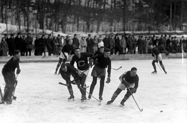
First off a little history: if you go look at the team photos in the concourse of Lynah, it's interesting to see the major changes that did happen between ~1977 and 1987. There's that really weird quasi-futuristic font where the bottom of the C underlines the "ornell," and then they went to that heavy double-twill lettering with the exaggerated word-arch in the mid-80s. I'll always give credit to Brian McCutcheon for returning to the classic design when he took over in 1987-88. For jersey collectors like me, it's been fun, even with the constant design to notice subtle changes as the vendors change. The 2003 version's fonts are much taller than the 1994 version, for example...I like to think for psychological reasons to make our huge team look even bigger.
Coach Schafer himself never wore the current design. This is what the 1985-86 era teams wore. Notice the "skeptic bear"(round "C" version) on the shoulders.
We have had one-weekend "alternate" jerseys over the past 10 years that were auctioned off for charity. I can't find pictures of that first one with the block "C" and the wide white stipe at the middle, but that was acceptable for a one-time charity thing. I know Jim Hyla wears his to games most of the time. We also had black and pink versions for the "Pink The Rink" promotion the entire league did for breast cancer. Most recently, we did 1967 replicas with tie-downs and the sans-serif font that looked really nice.
I take one look at Greg M's design and think it screams "RPI." Replace that cartoony logo with Puckman, and there you go. I'm not surprised current students don't have a problem with "Huggy Reach-around Bear," since it's all they've ever known, but I think that overall, alumni older than Class of '04 (or whenever those logo sets came out) dislike it. (Why not go with "Block C" without the bear muddling it up?). The red version of Greg M's design also reminds me a lot of the Blackhawks, obviouisly due to the sleeve striping. I like the school crest on the shoulders, but not the bear logo (why asymmetric patches?) These would be OK "3rd jerseys" for the (wait for it...) College Hockey video game.
Ben
But I've seen what happens when teams start messing with their traditional colors and design. Jersey designers will eventually have us wearing crimson.
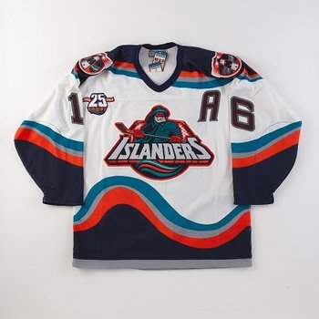
Yes, indeed. File under "Things that exist." BTW, they have this style for many hockey-deprived jock-factories.

[hockeyjerseyconcepts.blogspot.com]
FWIW, I hate stylized numbers, although I kind of like the look of the white yokes (with the Block C!) on the Alt 1 version. Also, this guy really seems to want us to look more like BU with the numbers on the front. (Credit to someone named Arthur Denny).

Having followed Cornell hockey for over 50 years, I'm bit of a traditionalist. The only change that I'd offer is a block "C" (sans bear) on the front of our home whites.
Why would I have any attachment to the tradition behind the current jerseys? My affiliation with the Cornell is maybe six months long. It's not like I've spent 30 years watching the team, nor have I grown up seeing the same jerseys. I haven't had time to absorb very much of the history behind the program- I've heard about the '70 team and Ken Dryden (I know, separate). That's about it. For long time fans, the idea of tradition works- and that's okay. I know I'd be willing to lead the riot if they tried to change the NY Rangers' sweaters, for instance. But while it's a very good reason not to change the uniforms (and is one that I can respect), it does nothing to change my opinion of them, which is that they're too bland to me bad. But who knows, maybe in a few years I'll be right there with all of you if someone proposes change. For now, though...
A few of you have replied that the mock-ups look like "____ College". First of all, I can confidently state that any similarity is completely unintentional, considering that I have never seen most of these college's uniforms before. It's the sentiment of "Do we really want to look like them?" that I really don't understand. I mean, do we really want to look exactly like BU? I don't think it really matters.
Now on to specific design details.
In regards to the black stripes- I figured they were kosher as they appear on the jersey-style sweatshirts being sold. I think that the reds look just as good without the black, but the whites require a complete rework.
Shoulder patches- Not sure what is meant by asymmetric. Is it the fact that it's two different patches, or is it that one is circular and the other isn't? If the former, isn't that standard?
As far as the bear goes, I neither love nor hate it. I elected to go with it because that's the athletic logo. I was actually planning on making a circular logo with Mcgraw Tower in it, but then I realized I have no artistic ability.
As far as Kyle's point on scaring me away goes- you'd have to be a bit harsher than this
.Greg M
Why would I have any attachment to the tradition behind the current jerseys? My affiliation with the Cornell is maybe six months long.
Stop right there. That's why you shouldn't be messing around with the jerseys. Let the tradition grow on you and save your portfolio for Project Runway.
The AUDIENCE for "a new Cornell jersey" isn't people who have no real connection with Cornell hockey. It is people who have a longstanding and deep affection for Cornell hockey and all of its traditions.
quality tweets | bluesky (twitter 2) | ALAB Series podcast | Other podcasts and writing
Why? Why can't it be new fans? I am genuinely curious, but I am also playing devil's advocate.ugarte
The AUDIENCE for "a new Cornell jersey" isn't people who have no real connection with Cornell hockey. It is people who have a longstanding and deep affection for Cornell hockey and all of its traditions.
There's your answer, in a nutshell. How would Yankee fans react to the removal of pinstripes and the addition dark jerseys with white NY and numbers? Or Giants fans to blue shirts with red numbers and pants and white helmets, and maybe a white yoke on the shoulders to match?Greg M
I know I'd be willing to lead the riot if they tried to change the NY Rangers' sweaters, for instance.
By the way, I happen to think the Rangers jerseys are too busy, in particular the whites, which are stripe-crazy. I dislike outlined letters and numbers. Makes 'em look fuzzy from a distance. Too many diddly little stripes on the shorts. But that's what the Rangers have worn in my lifetime, and they'd look goofy dressed otherwise. Just as Cornell looked goofy in those wayward years in the 70s and 80s. The Red Wings, Black Hawks, Canadiens, etc., with minor tweaks in size of letters, numbers, and logoes, have not changed their unis at all, and I doubt if I'll live to see them make any change, thankfully. These teams have great "tradition" and respect it. Fortunately, McCutcheon and Schafer have demonstrated that same respect, with the slight exception of last year's misbegotten screw-up.
Al DeFlorio '65
Greg, I encourage you to try to get a game worn either through the Athletic Dept garage sale or through the Issue Room. It's a great way to show spirit, and help the team, even if you think the uniforms are a little bland (and I have to say, I think the Rangers uniforms are absolutely classic, even if I don't like the team - this is the exact same thing).
Then this is purely from a comfort point of view: if the logo is one large patch that's sewn onto the jersey, it's not as comfortable to wear. since the fabric pulls differently that the embroidered letters.
You're confusing tradition and nostalgia. Tradition is something that can be tapped into no matter how much history you've been around for. Nostalgia is the particular associations we each build up around something.Greg M
I suppose I'll start out addressing the tradition point, because I think that's what has produced the most anger.
Why would I have any attachment to the tradition behind the current jerseys? My affiliation with the Cornell is maybe six months long. It's not like I've spent 30 years watching the team, nor have I grown up seeing the same jerseys. I haven't had time to absorb very much of the history behind the program- I've heard about the '70 team and Ken Dryden (I know, separate). That's about it.
One of the best things about the Cornell hockey fan experience is all the stuff that happened before you or I or anybody here (well, almost anybody) got here, and which will be here long after we're gone. I love my memories of actually being there for the 1986 ECAC championship, but I also have huge affection for the 60's and 70's teams that I never saw (that I never knew existed until on a whim a few freshman friends and I decided to go wait on line for hockey tickets in 1981 because we'd heard it was a fun thing to do).
Nostalgia is disposable -- as each generation dies off it dies with them. Tradition is forever. One of the ways of respecting it is continuity. That's why a traditional* sweater design means something more than just a design.
(* sticklers will point out -- around here, probably before the hour is out -- that the current sweaters are not exactly the same as the ones the Harkness teams wore.)
I guess my feeling is the tradition is what makes Cornell the dream-crushing, soul-devouring juggernaut. I haven't been here too much longer than you, but I feel a palpable connection to the history of the school. I guess what always appealed to me about Cornell hockey is how connected to the tradition you actually are. There's no goal horn, no jumbotron, and no pumping in music over a loudspeaker. You walk into Lynah and while its been renovated to make the concourses and the locker rooms nicer, it feels like an old rink. It's no architectural diamond, but the banners hanging from the ceiling, and the two jerseys of Dryden and Nieuwendyk make the place feel special. The pictures on the wall of the concourse of all the teams going back to the opening of the building, the national championship trophies, the all-american plaques in the trophy cases, its all part of the Cornell hockey tradition.Greg M
I suppose I'll start out addressing the tradition point, because I think that's what has produced the most anger.
Why would I have any attachment to the tradition behind the current jerseys? My affiliation with the Cornell is maybe six months long. It's not like I've spent 30 years watching the team, nor have I grown up seeing the same jerseys. I haven't had time to absorb very much of the history behind the program- I've heard about the '70 team and Ken Dryden (I know, separate). That's about it. For long time fans, the idea of tradition works- and that's okay. I know I'd be willing to lead the riot if they tried to change the NY Rangers' sweaters, for instance. But while it's a very good reason not to change the uniforms (and is one that I can respect), it does nothing to change my opinion of them, which is that they're too bland to me bad. But who knows, maybe in a few years I'll be right there with all of you if someone proposes change. For now, though...
A few of you have replied that the mock-ups look like "____ College". First of all, I can confidently state that any similarity is completely unintentional, considering that I have never seen most of these college's uniforms before. It's the sentiment of "Do we really want to look like them?" that I really don't understand. I mean, do we really want to look exactly like BU? I don't think it really matters.
Now on to specific design details.
In regards to the black stripes- I figured they were kosher as they appear on the jersey-style sweatshirts being sold. I think that the reds look just as good without the black, but the whites require a complete rework.
Shoulder patches- Not sure what is meant by asymmetric. Is it the fact that it's two different patches, or is it that one is circular and the other isn't? If the former, isn't that standard?
As far as the bear goes, I neither love nor hate it. I elected to go with it because that's the athletic logo. I was actually planning on making a circular logo with Mcgraw Tower in it, but then I realized I have no artistic ability.
As far as Kyle's point on scaring me away goes- you'd have to be a bit harsher than this
Yeah, we do encourage new chants and creating our own tradition, but why do you think the fan bases has the repertoire of creative insults and the intimidating reputation that it has? It's because of the tradition of the program. It's because Dryden only lost four games in the three years he played here. It's because we went 29-0 the season after he left. It's because Harvard tied a chicken to our goal, and we've never forgotten it. The program is what it is today because we came back from being 5-1 down against Providence in the ECAC quarterfinals in 1979 and won. Because we somehow made it to the Frozen Four in 1980. Because Nieuwendyk skated circles around ECAC opponents in his junior year, because we weren't all that good in the late 80s and early 90s, and because Michigan fans decided to appropriate many of our cheers (many of which were appropriated themselves) after a trip to Yost in '91. The Cornell hockey atmosphere isn't the same without the return to prominence that Schafer brought, the '03 Frozen Four run, the '05 loss to Minnesota in 2OT and the '06 loss to Wisconsin in 3OT. All along fans have created their own tradition, the cowbell starting in the 70s along with the fish throwing, to remote control goalie in the late 90s, to Hey Bâby in the early 2000s. But they've been building upon a common framework. The jerseys at least to me feel to be a part of that framework. Now the framework can change, after all we've done away with the line, but when something like this is so meaningful to so many people, its important to think about the programs identity.
The reason we don't want to look more like BU than we already do is because they're a long time hated rival, and because that's not what the Cornell program is. Quinnipiac (who's jerseys despite the color scheme your's most remind me of) plays in front of a half empty home rink, mainly because their program doesn't have much of a history and a tradition, and isn't particularly competitive nationally either. They're rarely relevant in their student body. Princeton has a beautiful rink, and not much fan support. That's why I don't want to be like other programs. Cornell hockey is always relevant to our student body. Even people without season tickets care how the team is doing and want to go to a game or two before they leave, because hockey games are an event on the hill. Without our tradition, Lynah would be mostly empty most weekends. In fact, it'd probably be like Starr, filled for only one game a year. Do we really want to turn our backs on what has made us who we are? I guess that's why most of us are reacting strongly in favor of tradition.
Take your client and get off of my lawn.Kyle Rose
Why? Why can't it be new fans? I am genuinely curious, but I am also playing devil's advocate.ugarte
The AUDIENCE for "a new Cornell jersey" isn't people who have no real connection with Cornell hockey. It is people who have a longstanding and deep affection for Cornell hockey and all of its traditions.
quality tweets | bluesky (twitter 2) | ALAB Series podcast | Other podcasts and writing
ugarte
Take your client and get off of my lawn.Kyle Rose
Why? Why can't it be new fans? I am genuinely curious, but I am also playing devil's advocate.ugarte
The AUDIENCE for "a new Cornell jersey" isn't people who have no real connection with Cornell hockey. It is people who have a longstanding and deep affection for Cornell hockey and all of its traditions.

Ben
What concerns me most is "new jersey creep"
...also known as "The Situation."
Beeeej, Esq.
"Cornell isn't an organization. It's a loose affiliation of independent fiefdoms united by a common hockey team."
- Steve Worona
Why? Because if it's going to be new fans, then we might as well let Nike come out with a whole new jersey style.Kyle Rose
Why? Why can't it be new fans? I am genuinely curious, but I am also playing devil's advocate.ugarte
The AUDIENCE for "a new Cornell jersey" isn't people who have no real connection with Cornell hockey. It is people who have a longstanding and deep affection for Cornell hockey and all of its traditions.
 No, I agree, learning something about CU hockey and what's happened over the years would seem to me to be a first requirement to designing a new style. I was so happy when I read that when Schafer first came he made each player research each former player who had worn their number. That is eventually how I got my jersey, the style is wrong, but sort of OK, but the name Lodboa on the back is right. In this case name tradition overcomes the lack of jersey tradition.
")
"Cornell Fans Made the Timbers Tremble", Boston Globe, March/1970
Cornell lawyers stopped the candy throwing. Jan/2005
Greg M
I suppose I'll start out addressing the tradition point, because I think that's what has produced the most anger.
I don't think you can classify the reactions here as "anger," more like bemusement. One of the biggest selling points of the CU program is its history, otherwise we wouldn't bother with all those banners or all the concourse displays. In the past, Coach Schafer has made players research former players and polish trophies.
Your Rangers analogy means you can understand where a lot of us are coming from, and I don't think anybody here has been outrageously rude to your view that the current jerseys are too boring. But for some of us, that's a lot like a Penn State or Notre Dame undergrad saying that their football uniforms are kind of bland and they should try to take some design cues from Oregon. I think it's cool that you care enough that you would take the time to do a high-quality mock up.
I mean, do we really want to look exactly like BU? I don't think it really matters.
That's a fair statement. In the picture I took of the MSG game, there was a lot of red/white on the ice. Same with the current jerseys of Miami and Wisconsin. There are a lot of Red/White teams out there. That said, the team I most want us to look like is Cornell.
In regards to the black stripes- I figured they were kosher as they appear on the jersey-style sweatshirts being sold.
I'm actually OK with black in CU jerseys. I think the lacrosse jerseys with the drop-shadows are very sharp. Basketball, football, and I'm sure other sports have had black outlining in recent years. It's a complement to the whites, and it's not like we're dripping green all over them or anything.
Shoulder patches- Not sure what is meant by asymmetric. Is it the fact that it's two different patches, or is it that one is circular and the other isn't? If the former, isn't that standard?
Two different patches just seems weird to me. I don't think it's standard at all. In the NHL, Blackhawks, Avalanche, Bruins, Hurricanes, Blue Jackets, Stars, Panthers, Senators, Sharks, Lightning, Leafs, Canucks, Capitals, and Jets all have identical shoulder patches on both sides. Only Flames, Predators, and Coyotes have different patches (or a patch only on one side) on the shoulders.
As far as Kyle's point on scaring me away goes- you'd have to be a bit harsher than this
Good. Then you'll fit in here just fine.
Basically, what we have is great. Be careful wishing for change.
Watch this
New squeakball unis look like high school. Thankfully, the Sweet Sixteen team that was given national exposure was classily-dressed. I haven't seen new lacrosse unis but I'm not looking forward to it. Nike's designs...well...suck.Ben
A bit more about jerseys changing often: Nike has given Men's lacrosse and basketball new uniforms for this season. And they kinda suck (in my opinion).
Al DeFlorio '65
Al DeFlorio
New squeakball unis look like high school. Thankfully, the Sweet Sixteen team that was given national exposure was classily-dressed. I haven't seen new lacrosse unis but I'm not looking forward to it. Nike's designs...well...suck.Ben
A bit more about jerseys changing often: Nike has given Men's lacrosse and basketball new uniforms for this season. And they kinda suck (in my opinion).
My guess is that they're the same ones we unveiled for the UVA game. Notice they don't have any black. And we're 0-1 in them.

[postinspostcards.wordpress.com]
They wore the new white version (with cherry red numbering and lettering) for the NCAA tourney game against UVA back in May. I shudder to think about what the away reds will look like.Al DeFlorio
New squeakball unis look like high school. Thankfully, the Sweet Sixteen team that was given national exposure was classily-dressed. I haven't seen new lacrosse unis but I'm not looking forward to it. Nike's designs...well...suck.Ben
A bit more about jerseys changing often: Nike has given Men's lacrosse and basketball new uniforms for this season. And they kinda suck (in my opinion).
Right. I'm glad the black is gone, although it somehow was less offensive to me on the lacrosse unis than on football or basketball, but the red is all wrong. It's a "weak" or "soft" color, whereas the previous red was a "strong" color.Ben
They wore the new white version (with cherry red numbering and lettering) for the NCAA tourney game against UVA back in May. I shudder to think about what the away reds will look like.Al DeFlorio
New squeakball unis look like high school. Thankfully, the Sweet Sixteen team that was given national exposure was classily-dressed. I haven't seen new lacrosse unis but I'm not looking forward to it. Nike's designs...well...suck.Ben
A bit more about jerseys changing often: Nike has given Men's lacrosse and basketball new uniforms for this season. And they kinda suck (in my opinion).
Al DeFlorio '65
Bear in mind, though, that they did change the Rangers' jerseys from 1976-1978 (the ones with the crest on the front) and, while it turned out poorly, I don't think there was any rioting.Greg M
I know I'd be willing to lead the riot if they tried to change the NY Rangers' sweaters, for instance.
RichH
Coach Schafer himself never wore the current design. This is what the 1985-86 era teams wore. Notice the "skeptic bear"(round "C" version) on the shoulders.
The bear formerly known as pissed off?

Greg M
I suppose I'll start out addressing the tradition point, because I think that's what has produced the most anger.
Why would I have any attachment to the tradition behind the current jerseys? My affiliation with the Cornell is maybe six months long. It's not like I've spent 30 years watching the team, nor have I grown up seeing the same jerseys. I haven't had time to absorb very much of the history behind the program- I've heard about the '70 team and Ken Dryden (I know, separate). That's about it. For long time fans, the idea of tradition works- and that's okay.
I think what's weird to us older folks reading this is still the tradition is so integral to our experience in addition our years following the team in person.
Don't get me wrong, when I came here I had never watched a hockey game in person and bought tickets from people outside Lynah my freshman year (no season tickets!!!!!), and at the time you could say that it was more about the fun of the current game I was watching rather than being part of some old tradition. It's not likely for a freshman with no previous exposure to Cornell to know of or understand that stuff; heck, even reading an encyclopedia of our year-by-year records and rosters wouldn't really do it, you have to get immersed in a all and converse with the older fans to truly understand it; it takes time. But over time that becomes as important to following the team as this year's record does (especially after you move away and the current team becomes more scores and stats (we have a guy named Gotovets? WTF name is that!), whereas the old years when you were there, ahh, that was when things were really happening!).
So trust me that over the next four years you'll start to see why things like the jersey are classic and important, and why it would fell weird to have it otherwise. To be the typical old guy, I can summarize it as "you'll get over it".
03/23/02: Maine 4, Harvard 3
03/28/03: BU 6, Harvard 4
03/26/04: Maine 5, Harvard 4
03/26/05: UNH 3, Harvard 2
03/25/06: Maine 6, Harvard 1
Hey, how do you get to be the old guy? Trying to take everything away from us, are you?French Rage
Greg M
I suppose I'll start out addressing the tradition point, because I think that's what has produced the most anger.
Why would I have any attachment to the tradition behind the current jerseys? My affiliation with the Cornell is maybe six months long. It's not like I've spent 30 years watching the team, nor have I grown up seeing the same jerseys. I haven't had time to absorb very much of the history behind the program- I've heard about the '70 team and Ken Dryden (I know, separate). That's about it. For Blong time fans, the idea of tradition works- and that's okay.
I think what's weird to us older folks reading this is still the tradition is so integral to our experience in addition our years following the team in person.
Don't get me wrong, when I came here I had never watched a hockey game in person and bought tickets from people outside Lynah my freshman year (no season tickets!!!!!), and at the time you could say that it was more about the fun of the current game I was watching rather than being part of some old tradition. It's not likely for a freshman with no previous exposure to Cornell to know of or understand that stuff; heck, even reading an encyclopedia of our year-by-year records and rosters wouldn't really do it, you have to get immersed in a all and converse with the older fans to truly understand it; it takes time. But over time that becomes as important to following the team as this year's record does (especially after you move away and the current team becomes more scores and stats (we have a guy named Gotovets? WTF name is that!), whereas the old years when you were there, ahh, that was when things were really happening!).
So trust me that over the next four years you'll start to see why things like the jersey are classic and important, and why it would fell weird to have it otherwise. To be the typical old guy, I can summarize it as "you'll get over it".
"Cornell Fans Made the Timbers Tremble", Boston Globe, March/1970
Cornell lawyers stopped the candy throwing. Jan/2005
Jim Hyla
Hey, how do you get to be the old guy? Trying to take everything away from us, are you?French Rage
Greg M
I suppose I'll start out addressing the tradition point, because I think that's what has produced the most anger.
Why would I have any attachment to the tradition behind the current jerseys? My affiliation with the Cornell is maybe six months long. It's not like I've spent 30 years watching the team, nor have I grown up seeing the same jerseys. I haven't had time to absorb very much of the history behind the program- I've heard about the '70 team and Ken Dryden (I know, separate). That's about it. For Blong time fans, the idea of tradition works- and that's okay.
I think what's weird to us older folks reading this is still the tradition is so integral to our experience in addition our years following the team in person.
Don't get me wrong, when I came here I had never watched a hockey game in person and bought tickets from people outside Lynah my freshman year (no season tickets!!!!!), and at the time you could say that it was more about the fun of the current game I was watching rather than being part of some old tradition. It's not likely for a freshman with no previous exposure to Cornell to know of or understand that stuff; heck, even reading an encyclopedia of our year-by-year records and rosters wouldn't really do it, you have to get immersed in a all and converse with the older fans to truly understand it; it takes time. But over time that becomes as important to following the team as this year's record does (especially after you move away and the current team becomes more scores and stats (we have a guy named Gotovets? WTF name is that!), whereas the old years when you were there, ahh, that was when things were really happening!).
So trust me that over the next four years you'll start to see why things like the jersey are classic and important, and why it would fell weird to have it otherwise. To be the typical old guy, I can summarize it as "you'll get over it".
You're not "the old guy", Jim. You're "the guy with the candy."
And you're also part of the tradition.
Larry Baum '72
Ithaca, NY
That was a wonderful tradition; I'm sad it has passed on.Larry72
The band regularly playing "Sweet Georgia Brown" is another along with the skating bear "stripping" during the last regular season game are also gone from the Lynah experience.
That said, I'm a traditionalist at heart. I don't want to see anything cartoon-y or RPI-puckmanesque. But I've never been wild about the uniform we wear currently. They're simple, but I don't think they're simple done right, like, for example, the Yankees. I wouldn't mind seeing a minor tweak or two to the jersey provided the change provides a traditional look. I'm not much for using paint or clipart, but personally, I think a jersey with just a big red "C" (like on the football helmets) or some variation thereof on the front would look better than the "Cornell" currently there. I wasn't wild about the 3rd jersey from a few years ago because of the darker color red that looked crimson-y.
Nothing is so sacrosanct it can't use a little change so long as the change is traditional in appearance. I mean, who would've thought we'd ever seen new (old) Michigan football helmets or jerseys. We could have something that's just as traditional, but sharper.
CUontheslopes
I'm frankly surprised that everyone jumped on the person who started the thread.
?
I don't think anybody "jumped on him." He floated an idea; most of us don't care for it and we said so, but not rudely.
Unless this is Eggshell Self Esteem Week, why would anybody expect anything different?
Now, if you mean jumped on the idea, I think the various responses above summarize why it's not that appealing to many.
Also, please don't compare the Cornell uniforms, which are classic, with the Yankees', which are ungainly and ugly and have really only attained classic stature through longevity.
> Nothing is so sacrosanct it can't use a little change
Actually, this is false, since change for change's sake is just aesthetic ADD, but I wouldn't put a sports jersey under the category of things which can't be changed. It's just that the current look is very, very sharp and clean, it would be hard to improve on it, and any time you open that can of worms you risk winding up with this:

Trotsky
Actually, this is false, since change for change's sake is just aesthetic ADD, but I wouldn't put a sports jersey under the category of things which can't be changed. It's just that the current look is very, very sharp and clean, it would be hard to improve on it, and any time you open that can of worms you risk winding up with this:
I think you meant to post the animated .gif:

RichH
Trotsky
Actually, this is false, since change for change's sake is just aesthetic ADD, but I wouldn't put a sports jersey under the category of things which can't be changed. It's just that the current look is very, very sharp and clean, it would be hard to improve on it, and any time you open that can of worms you risk winding up with this:
I think you meant to post the animated .gif:
The animated version is kind of cool. It would be a nice screen saver
![**]](http://elf.elynah.com/smileys/admin.gif "**]") .
.Trotsky
That was a wonderful tradition; I'm sad it has passed on.Larry72
The band regularly playing "Sweet Georgia Brown" is another along with the skating bear "stripping" during the last regular season game are also gone from the Lynah experience.
FWIW, at least since the early 1990s, the song the band played (and looped endlessly) for the Bear-strip was titled "The Stripper," which has a similar feel to "Sweet Georgia Brown," but is more burlesque-y. I'd try to find a link, but I'm sure a googling session with that search term would be an adventure my company's network administrators would frown upon.
Some examples of uniforms which themselves are truly special are (1) ND's navy uniform with golden dome; (2) Michigan football (and to a lesser degree, hockey) uniforms; (3) Army and Navy's traditional football uniforms; (4) a VERY limited category of logo-ed uniforms like USC and Texas. Note, I agree, very few have logos. The sharpest ones are often the simplest.
Cornell's hockey jerseys, however, to most outsiders just seem unremarkable. OK - skewer me as you will.
Strangely, I agree about the pinstripes... but I think the grey away jersey with the simple "NEW YORK" on the front and the three blue-white-blue stripes on the short sleeve ends (cuffs?) is clean and classic in the same way as the Cornell hockey jerseys: they are among my favorites.Trotsky
Also, please don't compare the Cornell uniforms, which are classic, with the Yankees', which are ungainly and ugly and have really only attained classic stature through longevity.
RichH
I like the school crest on the shoulders, but not the bear logo (why asymmetric patches?)
I object to including the "I Would Found an Institution for Dummies" simplified coat of arms any more than it already is. For me, this will always be the real coat of arms:

At the risk of sacrilege, I do like the coat of arms on the Hahvahd hockey jerseys, especially the dark ones. It gives the CU-H games at Lynah a nice visual feel.
French Rage
(we have a guy named Gotovets? WTF name is that!)
I imagine that someday we will have a player named Murphy. And then the universe will collapse.
jtwcornell91
RichH
I like the school crest on the shoulders, but not the bear logo (why asymmetric patches?)
I object to including the "I Would Found an Institution for Dummies" simplified coat of arms any more than it already is. For me, this will always be the real coat of arms:
At the risk of sacrilege, I do like the coat of arms on the Hahvahd hockey jerseys, especially the dark ones. It gives the CU-H games at Lynah a nice visual feel.
From the style guide:
When a formal visual identity is required—in ceremonial applications such as the university flag, presidential podiums, and commencement
regalia—the full-color Cornell emblem should be used.
The Cornell emblem must be sized at 3" in diameter or larger in most applications. For smaller ceremonial items (invitations, note- cards, programs, etc.) the emblem may be sized at a minimum of 1".
So the full-color emblem has not been retired. I personally think it would be kind of busy for a jersey. For what it's worth, I'm also a big fan of the new one-color logo. I think they did a great job on it (and that's the last time you'll ever hear me compliment anything Tommy Bruce has so much as sneezed on).
"[Hugh] Jessiman turned out to be a huge specimen of something alright." --Puck Daddy
YOU'RE GODDAMN RIGHT I WANTED THE OLD RED!CUontheslopes
It's not ugly, but I think many people here are biased, blinded if you will, by what the jersey stands for and not what it looks like.
quality tweets | bluesky (twitter 2) | ALAB Series podcast | Other podcasts and writing
CowbellGuy
jtwcornell91
RichH
I like the school crest on the shoulders, but not the bear logo (why asymmetric patches?)
I object to including the "I Would Found an Institution for Dummies" simplified coat of arms any more than it already is. For me, this will always be the real coat of arms:
At the risk of sacrilege, I do like the coat of arms on the Hahvahd hockey jerseys, especially the dark ones. It gives the CU-H games at Lynah a nice visual feel.
From the style guide:
When a formal visual identity is required—in ceremonial applications such as the university flag, presidential podiums, and commencement
regalia—the full-color Cornell emblem should be used.
The Cornell emblem must be sized at 3" in diameter or larger in most applications. For smaller ceremonial items (invitations, note- cards, programs, etc.) the emblem may be sized at a minimum of 1".
So the full-color emblem has not been retired. I personally think it would be kind of busy for a jersey. For what it's worth, I'm also a big fan of the new one-color logo. I think they did a great job on it (and that's the last time you'll ever hear me compliment anything Tommy Bruce has so much as sneezed on).
Maybe I'm sentimental because I still have the red sweatshirt with the old coat of arms in white on the breast and a big white C on the back, which I wore to most football games on the Hill. (It's the one I retired after our first Everblades championship and bring out only for championship games.)
Pinstripes look better in red, but then again, everything looks better in red.Kyle Rose
Strangely, I agree about the pinstripes... but I think the grey away jersey with the simple "NEW YORK" on the front and the three blue-white-blue stripes on the short sleeve ends (cuffs?) is clean and classic in the same way as the Cornell hockey jerseys: they are among my favorites.Trotsky
Also, please don't compare the Cornell uniforms, which are classic, with the Yankees', which are ungainly and ugly and have really only attained classic stature through longevity.

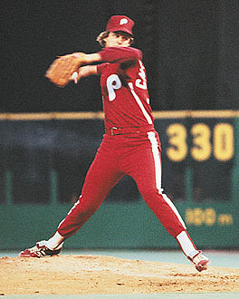
And note there is no black outlining the script "P" on the cap or the word "Phillies" on the shirt (nor the number on the back, either).css228
Pinstripes look better in red, but then again, everything looks better in red.Kyle Rose
Strangely, I agree about the pinstripes... but I think the grey away jersey with the simple "NEW YORK" on the front and the three blue-white-blue stripes on the short sleeve ends (cuffs?) is clean and classic in the same way as the Cornell hockey jerseys: they are among my favorites.Trotsky
Also, please don't compare the Cornell uniforms, which are classic, with the Yankees', which are ungainly and ugly and have really only attained classic stature through longevity.
Al DeFlorio '65
Thank you. Where by "thank you" I mean damn you to hell.RichH
I think you meant to post the animated .gif:
I agree completely. I think those unis are beautiful.Kyle Rose
Strangely, I agree about the pinstripes... but I think the grey away jersey with the simple "NEW YORK" on the front and the three blue-white-blue stripes on the short sleeve ends (cuffs?) is clean and classic in the same way as the Cornell hockey jerseys: they are among my favorites.Trotsky
Also, please don't compare the Cornell uniforms, which are classic, with the Yankees', which are ungainly and ugly and have really only attained classic stature through longevity.
Our of curiosity, did you know we had never had a player named Murphy? I had to look it up (we haven't, at least since 1958).jtwcornell91
I imagine that someday we will have a player named Murphy. And then the universe will collapse.
The Mets just got rid of the black drop-shadowing, leading me to hope that was just another one of those bad design phases that jerseys go through, like 80's numerals or 70's anything.Al DeFlorio
And note there is no black outlining the script "P" on the cap or the word "Phillies" on the shirt (nor the number on the back, either).
If we can just get rid of third jerseys we will have edged back from the cultural abyss that leads to, say,

Yep, absolutey no colors that aren't part of the official color scheme. On another note, here's another chilling example of what happens when you start straying too far from your roots.Al DeFlorio
And note there is no black outlining the script "P" on the cap or the word "Phillies" on the shirt (nor the number on the back, either).

Larry72
Traditions evolve. Jim and some others will remember Ozzie (someone help me with his last name) blowing his air-horn as Cornell came on the ice. He used to try and time it just as the ref (only one at that time) skated in front of him. Referee, Giles Threadgold (a character in his own right) used to hate that!! The band regularly playing "Sweet Georgia Brown" is another along with the skating bear "stripping" during the last regular season game are also gone from the Lynah experience.
Richardson. Maynard "Ozzie" Richardson.
"Drop the puck, turkey!"
I knew Ozzie well, as he was the chef in my fraternity before becoming a campus cop with a desk job (he had a very brief interlude in between where he was cooking at Arthur Treacher's Fish and Chips). Ozzie was quite a character and a great guy. He was also a great game show player - we'd watch Jeopardy and he was better than most of the contestants, and funny as hell when he knew the answers and they didn't. His permanent seat at the hockey games was first row in the seat adjacent and just to the left (facing the ice) of the Cornell bench.ACM
Larry72
Traditions evolve. Jim and some others will remember Ozzie (someone help me with his last name) blowing his air-horn as Cornell came on the ice. He used to try and time it just as the ref (only one at that time) skated in front of him. Referee, Giles Threadgold (a character in his own right) used to hate that!! The band regularly playing "Sweet Georgia Brown" is another along with the skating bear "stripping" during the last regular season game are also gone from the Lynah experience.
Richardson. Maynard "Ozzie" Richardson.
"Drop the puck, turkey!"
Jeff Kahn '70 '72
Trotsky
Our of curiosity, did you know we had never had a player named Murphy? I had to look it up (we haven't, at least since 1958).jtwcornell91
I imagine that someday we will have a player named Murphy. And then the universe will collapse.
Yeah, I checked it a while back (using TBRW, I'm sure); Mom and I had a running joke for years about all the Murphys in the ECAC (opponents and refs).
css228
Yep, absolutey no colors that aren't part of the official color scheme. On another note, here's another chilling example of what happens when you start straying too far from your roots.Al DeFlorio
And note there is no black outlining the script "P" on the cap or the word "Phillies" on the shirt (nor the number on the back, either).
FWIW, I think those unis were only used for spring training and never for regular season.
And I personally think the best Phils unis were the 1980'2 era ones - both home and away.