
ECAC Hockey 10/25
Posted by Cop at Lynah
ECAC Hockey 10/25
Posted by: Cop at Lynah (---.twcny.res.rr.com)
Date: October 25, 2013 06:01PM
Brown up on Yale 4-1 with minute to go at an empty Prudential Center
Edited 1 time(s). Last edit at 10/25/2013 06:03PM by Cop at Lynah.
Re: ECAC Hockey 10/25
Posted by: Jim Hyla (---.twcny.res.rr.com)
Date: October 25, 2013 06:35PM
Cop at Lynah
Brown up on Yale 4-1 with minute to go at an empty Prudential Center
That's the final. So I guess there won't be anymore first place votes for Yale next week.
___________________________
"Cornell Fans Made the Timbers Tremble", Boston Globe, March/1970
Cornell lawyers stopped the candy throwing. Jan/2005
"Cornell Fans Made the Timbers Tremble", Boston Globe, March/1970
Cornell lawyers stopped the candy throwing. Jan/2005
Re: ECAC Hockey 10/25
Posted by: billhoward (---.hsd1.nj.comcast.net)
Date: October 28, 2013 10:23AM
Cop at Lynah
Brown up on Yale 4-1 with minute to go at an empty Prudential Center
Box score Lists attendance at Prudential Center as 0. Next day, Yale at Princeton, lists 1,546.
Re: ECAC Hockey 10/25
Posted by: marty (---.nycap.res.rr.com)
Date: October 29, 2013 06:24PM
Harvard visits RIP tonight. Available for free on rpitv.org
Scout out the Little Red. They are undefeated at home.
Scout out the Little Red. They are undefeated at home.
Re: ECAC Hockey 10/25
Posted by: ursusminor (---.washdc.east.verizon.net)
Date: October 29, 2013 07:34PM
marty
Harvard visits RIP tonight. Available for free on rpitv.org
Scout out the Little Red. They are undefeated at home.
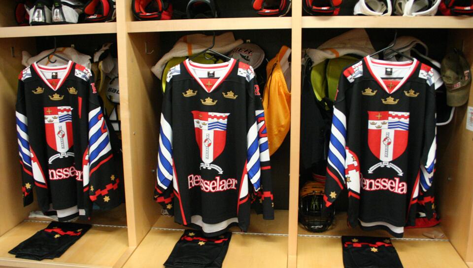
The Black Tuesday jerseys are worth posting.


They are even worse watching the game since the numbers on the back are black with a thin outline -- basically invisible.
Re: ECAC Hockey 10/25
Posted by: marty (---.sub-70-215-7.myvzw.com)
Date: October 29, 2013 08:19PM
ursusminor
marty
Harvard visits RIP tonight. Available for free on rpitv.org
Scout out the Little Red. They are undefeated at home.
The Black Tuesday jerseys are worth posting.
They are even worse watching the game since the numbers on the back are black with a thin outline -- basically invisible.
On the other hand you can read the players names on these. You can't read them on the regular home jerseys this year.
Re: ECAC Hockey 10/25
Posted by: Scersk '97 (---.dyn.optonline.net)
Date: October 29, 2013 11:33PM
Why do they keep misspelling RPI?
Re: ECAC Hockey 10/25
Posted by: Jeff Hopkins '82 (---.airproducts.com)
Date: October 30, 2013 08:23AM
ursusminor
marty
Harvard visits RIP tonight. Available for free on rpitv.org
Scout out the Little Red. They are undefeated at home.
The Black Tuesday jerseys are worth posting.
They are even worse watching the game since the numbers on the back are black with a thin outline -- basically invisible.
Wow. Those make European professional jerseys look subdued.

Re: ECAC Hockey 10/25
Posted by: Al DeFlorio (---.hsd1.ma.comcast.net)
Date: October 30, 2013 08:34AM
Another reason to thank Schafer.Jeff Hopkins '82
ursusminor
marty
Harvard visits RIP tonight. Available for free on rpitv.org
Scout out the Little Red. They are undefeated at home.
The Black Tuesday jerseys are worth posting.
They are even worse watching the game since the numbers on the back are black with a thin outline -- basically invisible.
Wow. Those make European professional jerseys look subdued.
___________________________
Al DeFlorio '65
Al DeFlorio '65
Re: ECAC Hockey 10/25
Posted by: Josh '99 (---.nyc.biz.rr.com)
Date: October 30, 2013 12:17PM
I don't like the font. It's the kind of typeface that looks good enough in a university logo or letterhead, but not great on a jersey. Do it without the crowns, put Rensselaer all caps vertically arched over the crest, and... well, it'd still be ugly, but less so, anyway.ursusminor
marty
Harvard visits RIP tonight. Available for free on rpitv.org
Scout out the Little Red. They are undefeated at home.
The Black Tuesday jerseys are worth posting.
They are even worse watching the game since the numbers on the back are black with a thin outline -- basically invisible.
I do like having the crest on the shoulders, at least.
Re: ECAC Hockey 10/25
Posted by: Trotsky (---.dc.dc.cox.net)
Date: October 30, 2013 01:11PM
The crowns and blue stripes and all that garbage are the point: reflecting all the coat of arms elements in the sweater.

Our crest has the potential for a similar clusterfuck, so hopefully we never go there, but I've never known Cornell to let aesthetics get in the way of making a buck.

Our crest has the potential for a similar clusterfuck, so hopefully we never go there, but I've never known Cornell to let aesthetics get in the way of making a buck.
Re: ECAC Hockey 10/25
Posted by: ursusminor (---.washdc.east.verizon.net)
Date: October 30, 2013 01:38PM

I couldn't find a rear view of the jersey except for during the game, but the only thing that was really visible there while the players were moving was the word "Engineers". Truly an awful jersey. Note also that the stars at the top of the stockings match the ones at the bottom of the jersey sleeves.
I don't usually have much positive to say about Schafer, but if he is responsible for Cornell keeping the historical jersey design, he has my praise for that.
Edited 1 time(s). Last edit at 10/30/2013 01:39PM by ursusminor.
Re: ECAC Hockey 10/25
Posted by: scoop85 (173.84.100.---)
Date: October 30, 2013 03:03PM
ursusminor
I couldn't find a rear view of the jersey except for during the game, but the only thing that was really visible there while the players were moving was the word "Engineers". Truly an awful jersey. Note also that the stars at the top of the stockings match the ones at the bottom of the jersey sleeves.
I don't usually have much positive to say about Schafer, but if he is responsible for Cornell keeping the historical jersey design, he has my praise for that.
Those are atrocious.
Re: ECAC Hockey 10/25
Posted by: RichH (134.223.116.---)
Date: October 30, 2013 03:04PM
ursusminor
Truly an awful jersey. Note also that the stars at the top of the stockings match the ones at the bottom of the jersey sleeves.
Well, isn't this a one-off jersey? They wore them last night, and that's it. It's not like you have to see them on the ice ever again. And if they were auctioned off for charity, then that's good for a charity. For historical reference, here's a gallery of the previous versions. And yes, these are the worst by a mile.
Quick question: Is RPI wearing these uniforms this year? My visit to their website is the first I've seen these:

I don't usually have much positive to say about Schafer, but if he is responsible for Cornell keeping the historical jersey design, he has my praise for that.
You can give credit to his predessesor Brian McCutcheon for returning to the old jerseys after several seasons away from them. Cornell has done one-off special auction-jersey nights. One was a Block C with a central white stripe, one was a 1970 replica (I think), and a pink-the-rink version. Then there was that year that Nike gave us the Swift jerseys for the Florida tournament where all the stripings were vertical. *shudder*
Edited 1 time(s). Last edit at 10/30/2013 03:06PM by RichH.
Re: ECAC Hockey 10/25
Posted by: Al DeFlorio (---.hsd1.ma.comcast.net)
Date: October 30, 2013 03:05PM
Even the ridiculous Puckman was better than this.ursusminor
I couldn't find a rear view of the jersey except for during the game, but the only thing that was really visible there while the players were moving was the word "Engineers". Truly an awful jersey. Note also that the stars at the top of the stockings match the ones at the bottom of the jersey sleeves.
I don't usually have much positive to say about Schafer, but if he is responsible for Cornell keeping the historical jersey design, he has my praise for that.

___________________________
Al DeFlorio '65
Al DeFlorio '65
Re: ECAC Hockey 10/25
Posted by: Jim Hyla (---.arthritishealthdoctors.com)
Date: October 30, 2013 04:46PM
Ken Schott reports that Alex Dell will officiate his last game 11/16.
___________________________
"Cornell Fans Made the Timbers Tremble", Boston Globe, March/1970
Cornell lawyers stopped the candy throwing. Jan/2005
"Cornell Fans Made the Timbers Tremble", Boston Globe, March/1970
Cornell lawyers stopped the candy throwing. Jan/2005
Re: ECAC Hockey 10/25
Posted by: Josh '99 (---.nyc.biz.rr.com)
Date: October 30, 2013 05:24PM
Right, I got that, but I think it's over the top to have the crest in its entirety on the chest and shoulders, and then in addition to that repeat individual elements of the crest on their own elsewhere. It's loud and ugly.Trotsky
The crowns and blue stripes and all that garbage are the point: reflecting all the coat of arms elements in the sweater.
If you wanted to do something similar with a Cornell jersey (I don't, but for the sake of argument), you could keep the jersey red, put the book with the motto on the chest, the two smaller shields on the shoulders... if you wanted to go crazy you could even make the yoke gold, print "Cornell University Founded By Ezra Cornell" around the collar, and use the silver in place of the traditional red around the sleeves and hem. We would all hate it, but it wouldn't be eye-searing like this.
Edit: I made a horrible amateurish mockup using MSPaint.
Edited 1 time(s). Last edit at 10/30/2013 05:30PM by Josh '99.
Re: ECAC Hockey 10/25
Posted by: Al DeFlorio (---.hsd1.ma.comcast.net)
Date: October 30, 2013 05:41PM
Maybe the book could read "Dream-crushing Soul-devouring Juggernaut."Josh '99
Right, I got that, but I think it's over the top to have the crest in its entirety on the chest and shoulders, and then in addition to that repeat individual elements of the crest on their own elsewhere. It's loud and ugly.Trotsky
The crowns and blue stripes and all that garbage are the point: reflecting all the coat of arms elements in the sweater.
If you wanted to do something similar with a Cornell jersey (I don't, but for the sake of argument), you could keep the jersey red, put the book with the motto on the chest, the two smaller shields on the shoulders... if you wanted to go crazy you could even make the yoke gold, print "Cornell University Founded By Ezra Cornell" around the collar, and use the silver in place of the traditional red around the sleeves and hem. We would all hate it, but it wouldn't be eye-searing like this.
Edit: I made a horrible amateurish mockup using MSPaint.

___________________________
Al DeFlorio '65
Al DeFlorio '65
Re: ECAC Hockey 10/25
Posted by: ursusminor (---.washdc.east.verizon.net)
Date: October 30, 2013 06:42PM
RichH
ursusminor
Truly an awful jersey. Note also that the stars at the top of the stockings match the ones at the bottom of the jersey sleeves.
Well, isn't this a one-off jersey? They wore them last night, and that's it. It's not like you have to see them on the ice ever again. And if they were auctioned off for charity, then that's good for a charity. For historical reference, here's a gallery of the previous versions. And yes, these are the worst by a mile.
Quick question: Is RPI wearing these uniforms this year? My visit to their website is the first I've seen these:
I don't usually have much positive to say about Schafer, but if he is responsible for Cornell keeping the historical jersey design, he has my praise for that.
You can give credit to his predessesor Brian McCutcheon for returning to the old jerseys after several seasons away from them. Cornell has done one-off special auction-jersey nights. One was a Block C with a central white stripe, one was a 1970 replica (I think), and a pink-the-rink version. Then there was that year that Nike gave us the Swift jerseys for the Florida tournament where all the stripings were vertical. *shudder*
Yes, those are RPI's regular home jerseys this year. The road jerseys are similar to those in the recent past although not identical.
Re: ECAC Hockey 10/25
Posted by: Swampy (---.ri.ri.cox.net)
Date: October 30, 2013 09:07PM
ursusminor
RichH
ursusminor
Truly an awful jersey. Note also that the stars at the top of the stockings match the ones at the bottom of the jersey sleeves.
Well, isn't this a one-off jersey? They wore them last night, and that's it. It's not like you have to see them on the ice ever again. And if they were auctioned off for charity, then that's good for a charity. For historical reference, here's a gallery of the previous versions. And yes, these are the worst by a mile.
Quick question: Is RPI wearing these uniforms this year? My visit to their website is the first I've seen these:
I don't usually have much positive to say about Schafer, but if he is responsible for Cornell keeping the historical jersey design, he has my praise for that.
You can give credit to his predessesor Brian McCutcheon for returning to the old jerseys after several seasons away from them. Cornell has done one-off special auction-jersey nights. One was a Block C with a central white stripe, one was a 1970 replica (I think), and a pink-the-rink version. Then there was that year that Nike gave us the Swift jerseys for the Florida tournament where all the stripings were vertical. *shudder*
Yes, those are RPI's regular home jerseys this year. The road jerseys are similar to those in the recent past although not identical.
So is the strategy to score a goal or two at the start of the game while the opposing team is still laughing?

Re: ECAC Hockey 10/25
Posted by: Jeff Hopkins '82 (---.airproducts.com)
Date: October 31, 2013 07:46AM
Swampy
ursusminor
RichH
ursusminor
Truly an awful jersey. Note also that the stars at the top of the stockings match the ones at the bottom of the jersey sleeves.
Well, isn't this a one-off jersey? They wore them last night, and that's it. It's not like you have to see them on the ice ever again. And if they were auctioned off for charity, then that's good for a charity. For historical reference, here's a gallery of the previous versions. And yes, these are the worst by a mile.
Quick question: Is RPI wearing these uniforms this year? My visit to their website is the first I've seen these:
I don't usually have much positive to say about Schafer, but if he is responsible for Cornell keeping the historical jersey design, he has my praise for that.
You can give credit to his predessesor Brian McCutcheon for returning to the old jerseys after several seasons away from them. Cornell has done one-off special auction-jersey nights. One was a Block C with a central white stripe, one was a 1970 replica (I think), and a pink-the-rink version. Then there was that year that Nike gave us the Swift jerseys for the Florida tournament where all the stripings were vertical. *shudder*
Yes, those are RPI's regular home jerseys this year. The road jerseys are similar to those in the recent past although not identical.
So is the strategy to score a goal or two at the start of the game while the opposing team is still PUKING
FYP
Sorry, only registered users may post in this forum.