
What makes a great/bad college hockey jersey?
Posted by Towerroad
What makes a great/bad college hockey jersey?
Posted by: Towerroad (---.bstnma.fios.verizon.net)
Date: December 10, 2011 05:03PM
As a separate thread what makes a great/bad college hockey jersey, aside from our beloved Red which of course is the best on the planet. Please post examples. Here is an example of bland nothing:
[www.gocrimson.com][/url]
and here is one I like
[shop.cbssports.com]
[www.gocrimson.com][/url]
and here is one I like
[shop.cbssports.com]
Re: What makes a great/bad college hockey jersey?
Posted by: Robb (---.ded.pacbell.net)
Date: December 11, 2011 09:36AM
What makes a great hockey jersey? I'm guessing one of the strongest influences is whether or not you're a fan of the team whose particular jersey is in question!
Re: What makes a great/bad college hockey jersey?
Posted by: Beeeej (Moderator)
Date: December 11, 2011 12:25PM
What you call "bland nothing" I call "classic." I certainly didn't like the Harvard men's hockey teams of the 1990s, but at least they didn't start slapping that goofy pilgrim-looking guy all over their jerseys.
___________________________
Beeeej, Esq.
"Cornell isn't an organization. It's a loose affiliation of independent fiefdoms united by a common hockey team."
- Steve Worona
Beeeej, Esq.
"Cornell isn't an organization. It's a loose affiliation of independent fiefdoms united by a common hockey team."
- Steve Worona
Re: What makes a great/bad college hockey jersey?
Posted by: Al DeFlorio (---.hsd1.ma.comcast.net)
Date: December 11, 2011 12:59PM
Agree. One of the best things about Harvard's unis is that they've changed little over the years. There was a brief period when they sported an ugly large "H" on the chest, but that seems to have passed blessedly into oblivion.Beeeej
What you call "bland nothing" I call "classic."
I'm not a big fan of two tones of the same color on a uni, a la Maine. Or script lettering. Double stripes everywhere, a la the BU throwbacks of a year or two ago, can be hard on the eyes. Block numbers are easiest to see. Keep things simple. Avoid frequent makeovers. And don't mess with what's classic (e.g., see the atrocities Navy wore in yesterday's Army-Navy game).
___________________________
Al DeFlorio '65
Al DeFlorio '65
Re: What makes a great/bad college hockey jersey?
Posted by: css228 (---.twcny.res.rr.com)
Date: December 11, 2011 02:02PM
INCH's take on this. I think they're generally right that is best to avoid cartoonish jerseys (e.g. Ferris State). Most of our league has pretty classy jerseys, especially some of the non-Ivy's like SLU, RPI and Clarkson's away greens. Clean, classic jerseys, good color schemes, Princeton's black jerseys are pretty sweet, but I'm not a big fan of the whites or the oranges they occasionally use. Least favorite in the league are Union and QPac, for different reasons. QPac is just too busy, Union's color scheme is just not my thing. As for the other simple jersey's in the league (Colgate, Yale and Dartmouth) I just don't think they have the history and tradition to back it up. I tend to feel the understated simple look works best when you have tons of tradition to speak for you (e,g, schools like Michigan, Minnestoa, BU, Wisconsin, and of course Cornell). The plain blue and white works for Penn State football because it has history. UNC basketball's classy blue and white jerseys don't need need alteration because of instant recognizability (please get rid of the hologram you guys added to the back). Something like Yale just doesn't work because the jerseys don't conjure up images of great Yale hockey past the same way Minnesota's sweaters do. But overall ECAC hockey doesn't have many bad jersey's, it just has some that are fantastic and some that leave me ambivalent. And Maine's jersey's are great, both home and away.

Edited 2 time(s). Last edit at 12/11/2011 06:12PM by css228.
Re: What makes a great/bad college hockey jersey?
Posted by: Aaron M. Griffin (---.altnpa.east.verizon.net)
Date: December 11, 2011 03:34PM
css228
INCH's take on this. I think they're generally right that is best to avoid cartoonish jerseys (e.g. Ferris State). Most of our league has pretty classy jerseys, especially some of the non-Ivy's like SLU, RPI and Clarkson's away greens. Clean, classic jerseys, good color schemes, Princeton's black jerseys are pretty sweet, but I'm not a big fan of the whites or the oranges they occasionally use. Least favorite in the league are Union and QPac, for different reasons. QPac is just too busy, Union's color scheme is just not my thing. As for the other simple jersey's in the league (Colgate, Yale and Dartmouth) I just don't think they have the history and tradition to back it up. I tend to feel the understated simple look works best when you have tons of tradition to speak for you (e,g, schools like Michigan, Minnestoa, BU, Wisconsin, and of course Cornell). The plain blue and white works for Penn State football because I has history. UNC basketball's classy blue and white jerseys don't need need alteration because of instant recognizably (please get rid of the hologram you guys added to the back). Something like Yale just doesn't work because the jerseys don't conjure up images of great Yale hockey past the same way Minnesota's sweaters do. But overall ECAC hockey doesn't have many bad jersey's, it just has some that are fantastic and some that leave me ambivalent. And Maine's jersey's are great, both home and away.
I am fairly certain that Yale would beg to differ. They have begun historical revision and now claim that they have a proud hockey tradition. Yale contends that it is the oldest collegiate hockey program in the nation. I think that some of Yale's program's propaganda even claims that they introduced the sport of hockey to the United States. As for their sweaters, I don't mind their away blues (as much as it pains me to admit that I like something from Yale), but their home whites are not aesthetically pleasing.
I like Union's color scheme. I like how their whites are the same as BU/Red Wings jerseys but with "garnet" sleeves. I like their prominent display of a version of the Union College seal on the front of that jersey as well. The black jerseys they use are nice too. I like the contrast between the "garnet," black, and white, and the fact that with those jerseys they avoided descendants into cartoonishness by using just "Union" emblazoned across the front.
Other than that, I agree with your conclusions. Quinnipiac's jersey look cartoonish. I do like the use of crests on the shoulder panels of both Harvard's and RPI's jerseys. Were Cornell to introduce a promotional jersey for an event (for an outdoor game perhaps) or an alternative jersey, I think it would be acceptable to include the Cornell University crest in a similar manner.
Worst jerseys in college hockey are those that use the cartoonish logos prominently displayed: Minnesota-Duluth, Alaska-Anchorage (not the jersey that reads "Seawolves" diagonally, I might dislike the color scheme more than the logo), and Ferris State. I do like Michigan State's jersey despite its use of a logo prominently, probably because the jersey other than the use of the Spartan helmet is traditional in its use of color and name placement.
One jersey that I despise that will become probably a jersey of a DI hockey program next year is the current jerseys that the Penn State hockey team wears. If the Nittany Lion logo is to be present on the jersey, I wish it were understated on he sleeves or shoulders rather than forced on the front in a manner that forces the team name and the logo to appear thrown together. The use of gray piping is a horrible design choice. I think that Penn State should err more toward its traditional football roots with classic simplicity, so adding a color to the palette for their hockey sweater makes no sense. (Yes, I know that other Penn State teams use gray in their color schemes). I think the colored piping in general on these jerseys is atrocious. I hope that Penn States changes to something more traditional before their DI debut. Better yet, I hope (knowing that it is unlikely) that Penn State will debut new jerseys that will represent the future Penn State sweater at their January 4, 2012 game at Citizens Bank Park in Philadelphia as part of the Winter Classic festivities so that I will not have to endure seeing this sweater again.
Re: What makes a great/bad college hockey jersey?
Posted by: css228 (---.twcny.res.rr.com)
Date: December 11, 2011 03:42PM
Penn State could be better but its not a terrible one. As far as Yale goes, the away blues are nice, I was referring more to their home whites. As for Union, I don't know something just doesn't sit right with me, but it is a bit unfair to criticize a school on their color scheme as long as they are staying true to their school colors. You have to work with the colors you're given. I agree that a crest on a special alternate would be nice, but its not necessarily great on a regular basis. One more note, Clarkson's home whites with the Knight helmet are disappointing.Aaron M. Griffin
css228
INCH's take on this. I think they're generally right that is best to avoid cartoonish jerseys (e.g. Ferris State). Most of our league has pretty classy jerseys, especially some of the non-Ivy's like SLU, RPI and Clarkson's away greens. Clean, classic jerseys, good color schemes, Princeton's black jerseys are pretty sweet, but I'm not a big fan of the whites or the oranges they occasionally use. Least favorite in the league are Union and QPac, for different reasons. QPac is just too busy, Union's color scheme is just not my thing. As for the other simple jersey's in the league (Colgate, Yale and Dartmouth) I just don't think they have the history and tradition to back it up. I tend to feel the understated simple look works best when you have tons of tradition to speak for you (e,g, schools like Michigan, Minnestoa, BU, Wisconsin, and of course Cornell). The plain blue and white works for Penn State football because I has history. UNC basketball's classy blue and white jerseys don't need need alteration because of instant recognizably (please get rid of the hologram you guys added to the back). Something like Yale just doesn't work because the jerseys don't conjure up images of great Yale hockey past the same way Minnesota's sweaters do. But overall ECAC hockey doesn't have many bad jersey's, it just has some that are fantastic and some that leave me ambivalent. And Maine's jersey's are great, both home and away.
I am fairly certain that Yale would beg to differ. They have begun historical revision and now claim that they have a proud hockey tradition. Yale contends that it is the oldest collegiate hockey program in the nation. I think that some of Yale's program's propaganda even claims that they introduced the sport of hockey to the United States. As for their sweaters, I don't mind their away blues (as much as it pains me to admit that I like something from Yale), but their home whites are not aesthetically pleasing.
I like Union's color scheme. I like how their whites are the same as BU/Red Wings jerseys but with "garnet" sleeves. I like their prominent display of a version of the Union College seal on the front of that jersey as well. The black jerseys they use are nice too. I like the contrast between the "garnet," black, and white, and the fact that with those jerseys they avoided descendants into cartoonishness by using just "Union" emblazoned across the front.
Other than that, I agree with your conclusions. Quinnipiac's jersey look cartoonish. I do like the use of crests on the shoulder panels of both Harvard's and RPI's jerseys. Were Cornell to introduce a promotional jersey for an event (for an outdoor game perhaps) or an alternative jersey, I think it would be acceptable to include the Cornell University crest in a similar manner.
Worst jerseys in college hockey are those that use the cartoonish logos prominently displayed: Minnesota-Duluth, Alaska-Anchorage (not the jersey that reads "Seawolves" diagonally, I might dislike the color scheme more than the logo), and Ferris State. I do like Michigan State's jersey despite its use of a logo prominently, probably because the jersey other than the use of the Spartan helmet is traditional in its use of color and name placement.
One jersey that I despise that will become probably a jersey of a DI hockey program next year is the current jerseys that the Penn State hockey team wears. If the Nittany Lion logo is to be present on the jersey, I wish it were understated on he sleeves or shoulders rather than forced on the front in a manner that forces the team name and the logo to appear thrown together. The use of gray piping is a horrible design choice. I think that Penn State should err more toward its traditional football roots with classic simplicity, so adding a color to the palette for their hockey sweater makes no sense. (Yes, I know that other Penn State teams use gray in their color schemes). I think the colored piping in general on these jerseys is atrocious. I hope that Penn States changes to something more traditional before their DI debut. Better yet, I hope (knowing that it is unlikely) that Penn State will debut new jerseys that will represent the future Penn State sweater at their January 4, 2012 game at Citizens Bank Park in Philadelphia as part of the Winter Classic festivities so that I will not have to endure seeing this sweater again.
Re: What makes a great/bad college hockey jersey?
Posted by: Aaron M. Griffin (---.altnpa.east.verizon.net)
Date: December 11, 2011 03:49PM
css228
One more note, Clarkson's home whites with the Knight helmet are disappointing.
I agree entirely. I wasn't going to point that out, but I feel that they are disappointing when compared to their other jerseys and the jerseys in the rest of the ECAC.
For Penn State, I am probably just being biased that a school with such traditions in most other sports (when Nike encouraged them to get flashier and more Oregon-esque with their football jerseys last season, Penn State responded with requesting new jerseys from Nike that removed the white trim on the neck and sleeves of their jerseys) and classic looks uses that sweater on the ice. I feel that Penn State would be more in line with what one would expect of a Penn State hockey sweater if they followed a simple design like that used on Michigan's (especially their diagonal maize sweater) and Cornell's jerseys.
Re: What makes a great/bad college hockey jersey?
Posted by: ftyuv (---.bstnma.east.verizon.net)
Date: December 11, 2011 05:55PM
I actually like Maine's a lot -- the two-tone blues work for me. I also like BC's a lot.
I don't know if I can list the attributes of what makes it good or bad, though. Hockey sweaters are like porn in that regard.
I don't know if I can list the attributes of what makes it good or bad, though. Hockey sweaters are like porn in that regard.
Re: What makes a great/bad college hockey jersey?
Posted by: ugarte (---.dyn.optonline.net)
Date: December 11, 2011 09:05PM
WHY DO I READ THESE THREADS!?
___________________________
quality tweets | bluesky (twitter 2) | ALAB Series podcast | Other podcasts and writing
quality tweets | bluesky (twitter 2) | ALAB Series podcast | Other podcasts and writing
Re: What makes a great/bad college hockey jersey?
Posted by: ansky629 (---.nycmny.east.verizon.net)
Date: December 11, 2011 09:17PM
I would say Cornell's current jerseys are pretty much it. Classic, clean and catches the eye.
Edited 1 time(s). Last edit at 12/11/2011 09:18PM by ansky629.
Re: What makes a great/bad college hockey jersey?
Posted by: Jeff Hopkins '82 (---.airproducts.com)
Date: December 12, 2011 08:19AM
I like simple and classic. Not a lot of colors and stripes and not a lot of patterns. To be honest, I've always like Dartmouth's sweaters.
If a logo is used instead of words, it needs to be simple and not-cartoonish - think Boston Bruins, Montreal Canadiens, Minnesota North-Stars, I think those Penn Sate unis would work if it was just the words or just the logo, but not both. Shoulder logos are OK if they're simple and complimentary - like the Blackhawks "C" with crossed tomahawks or even the Avalanche's bigfeet. Logos that can only be drawn by a professional artist are out, e.g. Florida Panthers, Nashville Predators, Quinnipiac Fighting Deer Ticks. And if you create a new logo just to sell merchandise, that's a non-starter.
If you're going to put words there it needs to be traditional block fonts. Like Cornell. No cursive writing. I've always liked the Rangers traditional sweater with the word Rangers running diagonally, but I hate the shield and the statue of liberty logos. But I detest single letters like Minnesota or Michigan, though that might just be because I dislike those teams.
Re: What makes a great/bad college hockey jersey?
Posted by: Drew (---.dyn.optonline.net)
Date: December 12, 2011 12:33PM
css228
Aaron M. Griffin
css228
One more note, Clarkson's home whites with the Knight helmet are disappointing.
I couldn't agree more. I don't like any of the "cartoon like" sweaters, tUMD, Clarkson, Qpac etc.
Re: What makes a great/bad college hockey jersey?
Posted by: Al DeFlorio (---.hsd1.ma.comcast.net)
Date: December 12, 2011 03:20PM
Agree 100%, except that sometimes Dartmouth goes away from the "classic" look and does strange things. Once, maybe ten years or so ago, they elongated the Dartmouth lettering on the front to the point where it was illegible. And there may have been times when they went to double stripes everywhere, which is just too busy and hard on the eyes. But dark green on white, or vice versa, is a nice look, with no frills or fripperies.Jeff Hopkins '82
I like simple and classic. Not a lot of colors and stripes and not a lot of patterns. To be honest, I've always like Dartmouth's sweaters.
If a logo is used instead of words, it needs to be simple and not-cartoonish - think Boston Bruins, Montreal Canadiens, Minnesota North-Stars, I think those Penn Sate unis would work if it was just the words or just the logo, but not both. Shoulder logos are OK if they're simple and complimentary - like the Blackhawks "C" with crossed tomahawks or even the Avalanche's bigfeet. Logos that can only be drawn by a professional artist are out, e.g. Florida Panthers, Nashville Predators, Quinnipiac Fighting Deer Ticks. And if you create a new logo just to sell merchandise, that's a non-starter.
If you're going to put words there it needs to be traditional block fonts. Like Cornell. No cursive writing. I've always liked the Rangers traditional sweater with the word Rangers running diagonally, but I hate the shield and the statue of liberty logos. But I detest single letters like Minnesota or Michigan, though that might just be because I dislike those teams.
___________________________
Al DeFlorio '65
Al DeFlorio '65
Re: What makes a great/bad college hockey jersey?
Posted by: Jim Hyla (---.arthritishealthdoctors.com)
Date: December 13, 2011 07:27AM
You want bad? From ECAC article on Spengler Cup.

___________________________
"Cornell Fans Made the Timbers Tremble", Boston Globe, March/1970
Cornell lawyers stopped the candy throwing. Jan/2005
"Cornell Fans Made the Timbers Tremble", Boston Globe, March/1970
Cornell lawyers stopped the candy throwing. Jan/2005
Re: What makes a great/bad college hockey jersey?
Posted by: Josh '99 (---.nyc.biz.rr.com)
Date: December 13, 2011 11:38AM
You know what makes a bad college hockey jersey? Sparkle cloth.

Also: mustard yellow. I'm trying to find a picture of those awful alternates that Clarkson had a few years back but I keep getting pictures of that prick David Clarkson instead.
Also: mustard yellow. I'm trying to find a picture of those awful alternates that Clarkson had a few years back but I keep getting pictures of that prick David Clarkson instead.
Re: What makes a great/bad college hockey jersey?
Posted by: Trotsky (---.hsd1.md.comcast.net)
Date: December 13, 2011 05:44PM
And post to them...ugarte
WHY DO I READ THESE THREADS!?
Re: What makes a great/bad college hockey jersey?
Posted by: HeafDog (---.c3-0.80w-ubr1.nyr-80w.ny.cable.rcn.com)
Date: December 15, 2011 11:33PM
Jeff Hopkins '82
And if you create a new logo just to sell merchandise, that's a non-starter.
*ahem*

Re: What makes a great/bad college hockey jersey?
Posted by: HeafDog (---.c3-0.80w-ubr1.nyr-80w.ny.cable.rcn.com)
Date: December 15, 2011 11:38PM
css228
Most of our league has pretty classy jerseys, especially some of the non-Ivy's like SLU, RPI and Clarkson's away greens.
Clarkson?? Green and yellow?!? MY EYES!
To make things worse, they had a third jersey a couple of years ago (not sure if it's the same one Josh was referring to) that attempted to ameliorate things by adding black to the picture. Sorry, green-and-yellow color schemes, but not even black can help you.
Re: What makes a great/bad college hockey jersey?
Posted by: HeafDog (---.c3-0.80w-ubr1.nyr-80w.ny.cable.rcn.com)
Date: December 15, 2011 11:54PM
Jeff Hopkins '82
If you're going to put words there it needs to be traditional block fonts. Like Cornell. No cursive writing. I've always liked the Rangers traditional sweater with the word Rangers running diagonally, but I hate the shield and the statue of liberty logos. But I detest single letters like Minnesota or Michigan, though that might just be because I dislike those teams.
I disagree (as long as you have a decent-looking single letter -- Minnesota's M is sort of strange). Your brand is your brand. You go to Ann Arbor, and you see that maize-colored M everywhere you look -- on No Parking signs, buses (and the buses even occasionally display "Hail To The Victors" on their electronic destination signs -- I think that's freaking SWEET), etc. Actually, largely from having been there a few times, I kinda wish CU had its act together more and did pretty much the same thing, by going with a consistent typeface and branding throughout everything (both on athletic uniforms and otherwise), and sticking with it. If I remember correctly, the football, baseball, and lacrosse teams have different typefaces than, say, hockey and hoops. What's up with that? All the teams represent the same university, don't they?
I know everyone is totally married to the traditional CU jerseys that we've always had, so I know I'm risking getting kicked off the forum and out of Lynah for saying this, but I certainly wouldn't mind going with just the big, college block, single letter C on the front of our sweaters. Why should anyone have to spell out what the C is for? People should see the C and instantly know that it's for dear old Cornell. And that we're gonna kick your asses.
Re: What makes a great/bad college hockey jersey?
Posted by: css228 (---.twcny.res.rr.com)
Date: December 16, 2011 01:14AM
Green and gold fits the character of the nickname.HeafDog
css228
Most of our league has pretty classy jerseys, especially some of the non-Ivy's like SLU, RPI and Clarkson's away greens.
Clarkson?? Green and yellow?!? MY EYES!
To make things worse, they had a third jersey a couple of years ago (not sure if it's the same one Josh was referring to) that attempted to ameliorate things by adding black to the picture. Sorry, green-and-yellow color schemes, but not even black can help you.
Re: What makes a great/bad college hockey jersey?
Posted by: Trotsky (---.hsd1.md.comcast.net)
Date: December 16, 2011 11:17AM
Clarkson's traditional sweaters are fantastic. The little Knight Plume thing is awful. And the notorious mustard throw-up third jersey of a few years ago had a level of hideous only Western Michigan has approached.
"What makes a great/bad hockey jersey?" is fairly straightforward:
great: simple / bad: busy

"What makes a great/bad hockey jersey?" is fairly straightforward:
great: simple / bad: busy
Edited 4 time(s). Last edit at 12/16/2011 11:24AM by Trotsky.
Re: What makes a great/bad college hockey jersey?
Posted by: Ben (158.143.162.---)
Date: December 16, 2011 11:30AM
The gold WMU jerseys are somewhere between hideous and bizarre.
Re: What makes a great/bad college hockey jersey?
Posted by: Josh '99 (---.nyc.biz.rr.com)
Date: December 16, 2011 01:45PM
Nah, I'm fine with green and gold as a general color scheme so long as green is the dominant color and the gold (which as you point out is really yellow when you make clothing out of it) is restricted to being an accent color. It's using the gold as the primary color that's the problem.HeafDog
css228
Most of our league has pretty classy jerseys, especially some of the non-Ivy's like SLU, RPI and Clarkson's away greens.
Clarkson?? Green and yellow?!? MY EYES!
To make things worse, they had a third jersey a couple of years ago (not sure if it's the same one Josh was referring to) that attempted to ameliorate things by adding black to the picture. Sorry, green-and-yellow color schemes, but not even black can help you.
Re: What makes a great/bad college hockey jersey?
Posted by: judy (---.wsh.clearwire-wmx.net)
Date: December 27, 2011 10:22PM
(I know I'm late to the party)
Mustard yellow: you mean like Nashville and Boston's third jerseys at some point in time? Cuz those are damn ugly and regardless of who they're playing in those jerseys, I have no idea what happens in those games because all I can think is "Damn, that's an ugly shade of yellow!"
Mustard yellow: you mean like Nashville and Boston's third jerseys at some point in time? Cuz those are damn ugly and regardless of who they're playing in those jerseys, I have no idea what happens in those games because all I can think is "Damn, that's an ugly shade of yellow!"
Re: What makes a great/bad college hockey jersey?
Posted by: billhoward (---.hsd1.nj.comcast.net)
Date: December 28, 2011 07:26AM
A good hip check on the Gopher and as he sails end over end, it looks like he's skating for Wisconsin.Jeff Hopkins '82
... But I detest single letters like Minnesota or Michigan, though that might just be because I dislike those teams.
Re: What makes a great/bad college hockey jersey?
Posted by: George64 (---.rochester.res.rr.com)
Date: January 26, 2012 11:02AM
We can only hope that Nike doesn't opt to redesign hockey jerseys. (Nike unveils 'platinum' hoops uniforms) Even if they do, we may be safe as the Nike brand didn't exist the last time we won a national championship. (The teams selected have won NCAA titles wearing Nike gear: the Arizona, UConn, Duke, Florida, Kentucky, North Carolina and Syracuse men and the Baylor and UConn women.)
Re: What makes a great/bad college hockey jersey?
Posted by: RichH (---.northropgrumman.com)
Date: January 26, 2012 11:32AM
George64
We can only hope that Nike doesn't opt to redesign hockey jerseys. (Nike unveils 'platinum' hoops uniforms) Even if they do, we may be safe as the Nike brand didn't exist the last time we won a national championship. (The teams selected have won NCAA titles wearing Nike gear: the Arizona, UConn, Duke, Florida, Kentucky, North Carolina and Syracuse men and the Baylor and UConn women.)
Ah. Too late. Two words: "Nike Swift." Perhaps you weren't around for the 2006 Everblades Tournament and the related pulling of hair & gnashing of teeth, as the new design gave all the test schools (which included Cornell) vertical striping, to match the Swift's rollout in international play. Check out this thread for all the details and photos:
[elf.elynah.com]
FWIW, Over at least the past 20 years, the CU team has switched between Bauer & CCM jerseys. Nike bought Bauer, and began to brand their jerseys with the swoosh about a decade ago. Nike sold off Bauer in 2008. CCM was bought by Reebok/Adidas. NHL jerseys were rebranded with Reebok logos, and the RBK EDGE jersey was introduced (similar to the Nike Swift).
Edited 1 time(s). Last edit at 01/26/2012 11:35AM by RichH.
Re: What makes a great/bad college hockey jersey?
Posted by: Aaron M. Griffin (---.altnpa.east.verizon.net)
Date: September 11, 2012 04:33PM
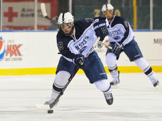
I figured that considering we are more than a month away from the first regular-season game of the season I would resurrect this thread. Penn State released its jerseys for its first NCAA Division I season today and I think they present ample fodder for conversation on this thread's topic. Here they are. Thoughts? I enjoy how the whites are blue versions of Cornell's home whites with the Nittany Lion logo in place of the Cornell block lettering.

___________________________
Class of 2010
2009-10 Cornell-Harvard:
11/07/2009 Ithaca 6-3
02/19/2010 Cambridge 3-0
03/12/2010 Ithaca 5-1
03/13/2010 Ithaca 3-0
Class of 2010
2009-10 Cornell-Harvard:
11/07/2009 Ithaca 6-3
02/19/2010 Cambridge 3-0
03/12/2010 Ithaca 5-1
03/13/2010 Ithaca 3-0
Re: What makes a great/bad college hockey jersey?
Posted by: TimV (---.amc.edu)
Date: September 11, 2012 04:45PM
Like it. Move the numbers down to the upper arm just above the stripe and add the same logo, smaller, on the shoulder. Helmet should be the same as football's white with a navy equatorial stripe. No logo.
And nameplates are OK on the jersies at Penn State now.
And nameplates are OK on the jersies at Penn State now.
___________________________
"Yo Paulie - I don't see no crowd gathering 'round you neither."
"Yo Paulie - I don't see no crowd gathering 'round you neither."
Re: What makes a great/bad college hockey jersey?
Posted by: redice (---.sub-75-213-136.myvzw.com)
Date: September 11, 2012 05:20PM
I like the laces too!!
___________________________
"If a player won't go in the corners, he might as well take up checkers."
-Ned Harkness
"If a player won't go in the corners, he might as well take up checkers."
-Ned Harkness
Re: What makes a great/bad college hockey jersey?
Posted by: TimV (---.amc.edu)
Date: September 11, 2012 05:52PM
AAron- did you add the nameplate? I didn't think it was there when I first saw your post...
___________________________
"Yo Paulie - I don't see no crowd gathering 'round you neither."
"Yo Paulie - I don't see no crowd gathering 'round you neither."
Re: What makes a great/bad college hockey jersey?
Posted by: Trotsky (---.hsd1.md.comcast.net)
Date: September 11, 2012 08:27PM
Get rid of the logo and replace with a simple PENN STATE, and they'd have something.
Re: What makes a great/bad college hockey jersey?
Posted by: Aaron M. Griffin (---.altnpa.east.verizon.net)
Date: September 11, 2012 09:21PM
TimV
AAron- did you add the nameplate? I didn't think it was there when I first saw your post...
No, I didn't add the nameplate. The aways have no name on the back and an embroidered Nittany Lion logo at the top. The whites have a nameplate. And, to answer your other question/comment, they will have helmets like PSU football helmets that are white with the blue stripe down the middle.
___________________________
Class of 2010
2009-10 Cornell-Harvard:
11/07/2009 Ithaca 6-3
02/19/2010 Cambridge 3-0
03/12/2010 Ithaca 5-1
03/13/2010 Ithaca 3-0
Class of 2010
2009-10 Cornell-Harvard:
11/07/2009 Ithaca 6-3
02/19/2010 Cambridge 3-0
03/12/2010 Ithaca 5-1
03/13/2010 Ithaca 3-0
Re: What makes a great/bad college hockey jersey?
Posted by: css228 (---.twcny.res.rr.com)
Date: September 11, 2012 10:03PM
Solid. Really like those jerseys. Especially the away blues. They're really sharp.Aaron M. Griffin
TimV
AAron- did you add the nameplate? I didn't think it was there when I first saw your post...
No, I didn't add the nameplate. The aways have no name on the back and an embroidered Nittany Lion logo at the top. The whites have a nameplate. And, to answer your other question/comment, they will have helmets like PSU football helmets that are white with the blue stripe down the middle.
Re: What makes a great/bad college hockey jersey?
Posted by: TimV (---.amc.edu)
Date: September 12, 2012 10:00AM
I suppose you want that all caps, arranged in an arc. Any particular font?
___________________________
"Yo Paulie - I don't see no crowd gathering 'round you neither."
"Yo Paulie - I don't see no crowd gathering 'round you neither."
Re: What makes a great/bad college hockey jersey?
Posted by: Trotsky (---.dc.dc.cox.net)
Date: September 12, 2012 10:41AM
TimV
I suppose you want that all caps, arranged in an arc. Any particular font?
No arc. Just "STATE." Basic font.
The classic look:

Re: What makes a great/bad college hockey jersey?
Posted by: RichH (---.northropgrumman.com)
Date: September 12, 2012 11:05AM
For comparison, here's what they had hanging on the wall-of-jerseys at the Frozen Four in Tampa (lower left). I assume it's what Penn St. has been wearing in the AHCA.

Me, I'm still wondering why all 18 variants of Michigan aren't up there.
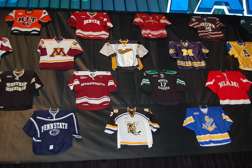
Me, I'm still wondering why all 18 variants of Michigan aren't up there.
Re: What makes a great/bad college hockey jersey?
Posted by: Aaron M. Griffin (---.altnpa.east.verizon.net)
Date: September 12, 2012 09:18PM
RichH
For comparison, here's what they had hanging on the wall-of-jerseys at the Frozen Four in Tampa (lower left). I assume it's what Penn St. has been wearing in the AHCA.
Me, I'm still wondering why all 18 variants of Michigan aren't up there.
I'm glad I am not alone in thinking Michigan's rebranding every season and different jersey for almost every game is ridiculous. One thing I liked other than the simplicity of the Penn State design is that it did not come with four forms like Michigan this coming season.
Yes, that was the ACHA era jersey. The home jerseys looked like:

___________________________
Class of 2010
2009-10 Cornell-Harvard:
11/07/2009 Ithaca 6-3
02/19/2010 Cambridge 3-0
03/12/2010 Ithaca 5-1
03/13/2010 Ithaca 3-0
Class of 2010
2009-10 Cornell-Harvard:
11/07/2009 Ithaca 6-3
02/19/2010 Cambridge 3-0
03/12/2010 Ithaca 5-1
03/13/2010 Ithaca 3-0
Re: What makes a great/bad college hockey jersey?
Posted by: jtn27 (---.twcny.res.rr.com)
Date: September 12, 2012 09:48PM
RichH
Me, I'm still wondering why all 18 variants of Michigan aren't up there.
They had a whole wall for that down the hall.
___________________________
Class of 2013
Class of 2013
Re: What makes a great/bad college hockey jersey?
Posted by: Josh '99 (---.nycmny.fios.verizon.net)
Date: September 13, 2012 02:40PM
I like either the jersey with just the logo, or Trotsky's proposed jersey with just the text, better than this one with the logo and the text, which I think is too busy. The only way that doesn't look bad (see also the RIT jersey on the top left) is if the text is integrated into the logo (see the LSSU jersey on the bottom right).RichH
For comparison, here's what they had hanging on the wall-of-jerseys at the Frozen Four in Tampa (lower left). I assume it's what Penn St. has been wearing in the AHCA.
Me, I'm still wondering why all 18 variants of Michigan aren't up there.
Re: What makes a great/bad college hockey jersey?
Posted by: jtwcornell91 (Moderator)
Date: September 13, 2012 07:14PM
Aaron M. Griffin
Yes, that was the ACHA era jersey. The home jerseys looked like:
Christ on a crutch, those helmets look awful. Michigan is a special case; otherwise don't wear football helmets to a hocket game!
Re: What makes a great/bad college hockey jersey?
Posted by: RichH (---.hsd1.ct.comcast.net)
Date: September 14, 2012 08:47AM
jtwcornell91
Aaron M. Griffin
Yes, that was the ACHA era jersey. The home jerseys looked like:
Christ on a crutch, those helmets look awful. Michigan is a special case; otherwise don't wear football helmets to a hocket game!
Also, eye black.
Re: What makes a great/bad college hockey jersey?
Posted by: Aaron M. Griffin (---.altnpa.east.verizon.net)
Date: September 14, 2012 09:15AM
RichH
jtwcornell91
Aaron M. Griffin
Yes, that was the ACHA era jersey. The home jerseys looked like:
Christ on a crutch, those helmets look awful. Michigan is a special case; otherwise don't wear football helmets to a hocket game!
Also, eye black.
The eye black has an explanation. This photo is taken from the game that Penn State played at Citizens Bank on the 2012 Winter Classic rink. Most players in outdoor games use eye black. It supposedly reduces glare from the sun and lights off of the ice surface.
___________________________
Class of 2010
2009-10 Cornell-Harvard:
11/07/2009 Ithaca 6-3
02/19/2010 Cambridge 3-0
03/12/2010 Ithaca 5-1
03/13/2010 Ithaca 3-0
Class of 2010
2009-10 Cornell-Harvard:
11/07/2009 Ithaca 6-3
02/19/2010 Cambridge 3-0
03/12/2010 Ithaca 5-1
03/13/2010 Ithaca 3-0
Re: What makes a great/bad college hockey jersey?
Posted by: RichH (---.northropgrumman.com)
Date: September 14, 2012 10:50AM
Aaron M. Griffin
RichH
jtwcornell91
Aaron M. Griffin
Yes, that was the ACHA era jersey. The home jerseys looked like:
Christ on a crutch, those helmets look awful. Michigan is a special case; otherwise don't wear football helmets to a hocket game!
Also, eye black.
The eye black has an explanation. This photo is taken from the game that Penn State played at Citizens Bank on the 2012 Winter Classic rink. Most players in outdoor games use eye black. It supposedly reduces glare from the sun and lights off of the ice surface.
Given that context the photo lacked, I withdraw my mockery of the eye black. As for the stripe, I refer the right honourable gentleman to the comments jtwcornell91 made some moments ago.
Re: What makes a great/bad college hockey jersey?
Posted by: Aaron M. Griffin (---.altnpa.east.verizon.net)
Date: September 14, 2012 11:40AM
I agree with the helmet criticism. The one addendum to jtwcornell91's initial comment that I would prefer is to have no exception for Michigan. I find the winged hockey helmet just as ridiculous as Penn State football helmets on ice.RichH
Aaron M. Griffin
RichH
jtwcornell91
Aaron M. Griffin
Yes, that was the ACHA era jersey. The home jerseys looked like:
Christ on a crutch, those helmets look awful. Michigan is a special case; otherwise don't wear football helmets to a hocket game!
Also, eye black.
The eye black has an explanation. This photo is taken from the game that Penn State played at Citizens Bank on the 2012 Winter Classic rink. Most players in outdoor games use eye black. It supposedly reduces glare from the sun and lights off of the ice surface.
Given that context the photo lacked, I withdraw my mockery of the eye black. As for the stripe, I refer the right honourable gentleman to the comments jtwcornell91 made some moments ago.
___________________________
Class of 2010
2009-10 Cornell-Harvard:
11/07/2009 Ithaca 6-3
02/19/2010 Cambridge 3-0
03/12/2010 Ithaca 5-1
03/13/2010 Ithaca 3-0
Class of 2010
2009-10 Cornell-Harvard:
11/07/2009 Ithaca 6-3
02/19/2010 Cambridge 3-0
03/12/2010 Ithaca 5-1
03/13/2010 Ithaca 3-0
Re: What makes a great/bad college hockey jersey?
Posted by: Al DeFlorio (---.hsd1.ma.comcast.net)
Date: September 14, 2012 02:08PM
Agree. It just looks goofy on a hockey player.Aaron M. Griffin
I find the winged hockey helmet just as ridiculous as Penn State football helmets on ice.
And we should remember that it's supposed to look like a fierce tiger with his ears pinned back. The design was introduced by Fritz Crisler when he coached football at Princeton.
___________________________
Al DeFlorio '65
Al DeFlorio '65
Re: What makes a great/bad college hockey jersey?
Posted by: jtn27 (---.twcny.res.rr.com)
Date: September 14, 2012 02:42PM
Al DeFlorio
Agree. It just looks goofy on a hockey player.Aaron M. Griffin
I find the winged hockey helmet just as ridiculous as Penn State football helmets on ice.
And we should remember that it's supposed to look like a fierce tiger with his ears pinned back. The design was introduced by Fritz Crisler when he coached football at Princeton.
I'm not seeing that at all.
___________________________
Class of 2013
Class of 2013
Re: What makes a great/bad college hockey jersey?
Posted by: Al DeFlorio (---.hsd1.ma.comcast.net)
Date: September 14, 2012 04:22PM
http://www.princeton.edu/football/helmet.htmljtn27
Al DeFlorio
Agree. It just looks goofy on a hockey player.Aaron M. Griffin
I find the winged hockey helmet just as ridiculous as Penn State football helmets on ice.
And we should remember that it's supposed to look like a fierce tiger with his ears pinned back. The design was introduced by Fritz Crisler when he coached football at Princeton.
I'm not seeing that at all.
The orange band above the forehead is the top of a tiger's head and the so-called "wings" are the tiger's pinned-back ears. The stripes are...well...tiger stripes.
___________________________
Al DeFlorio '65
Al DeFlorio '65
Re: What makes a great/bad college hockey jersey?
Posted by: Rita (---.med.miami.edu)
Date: September 14, 2012 06:02PM
Al DeFlorio
http://www.princeton.edu/football/helmet.htmljtn27
Al DeFlorio
Agree. It just looks goofy on a hockey player.Aaron M. Griffin
I find the winged hockey helmet just as ridiculous as Penn State football helmets on ice.
And we should remember that it's supposed to look like a fierce tiger with his ears pinned back. The design was introduced by Fritz Crisler when he coached football at Princeton.
I'm not seeing that at all.
The orange band above the forehead is the top of a tiger's head and the so-called "wings" are the tiger's pinned-back ears. The stripes are...well...tiger stripes.
"When Crisler left Princeton in 1938, he took the helmet design with him to Michigan, where in maize and blue it became an icon of that university's football program. This distinctive helmet design which originated at Princeton - where intercollegiate football was born -..."
Michigan sports have certainly benefitted from Ivy League creativity. Just think without us, they would have common, plain old football helmets and nothing but that damn annoying song to listen to at their hockey games.
Happy Friday. Only 29 more days until the red/white game.......
Re: What makes a great/bad college hockey jersey?
Posted by: marty (---.nycap.res.rr.com)
Date: September 14, 2012 07:23PM
Rita
Al DeFlorio
http://www.princeton.edu/football/helmet.htmljtn27
Al DeFlorio
Agree. It just looks goofy on a hockey player.Aaron M. Griffin
I find the winged hockey helmet just as ridiculous as Penn State football helmets on ice.
And we should remember that it's supposed to look like a fierce tiger with his ears pinned back. The design was introduced by Fritz Crisler when he coached football at Princeton.
I'm not seeing that at all.
The orange band above the forehead is the top of a tiger's head and the so-called "wings" are the tiger's pinned-back ears. The stripes are...well...tiger stripes.
"When Crisler left Princeton in 1938, he took the helmet design with him to Michigan, where in maize and blue it became an icon of that university's football program. This distinctive helmet design which originated at Princeton - where intercollegiate football was born -..."
Michigan sports have certainly benefitted from Ivy League creativity. Just think without us, they would have common, plain old football helmets and nothing but that damn annoying song to listen to at their hockey games.
Happy Friday. Only 29 more days until the red/white game.......
Victors antidote!
Edited 1 time(s). Last edit at 09/14/2012 07:25PM by marty.
Logoware for the fans
Posted by: billhoward (---.hsd1.nj.comcast.net)
Date: September 24, 2012 10:52AM
Something for the people in the stands.

Re: What makes a great/bad college hockey jersey?
Posted by: Aaron M. Griffin (---.altnpa.east.verizon.net)
Date: October 01, 2012 11:38PM
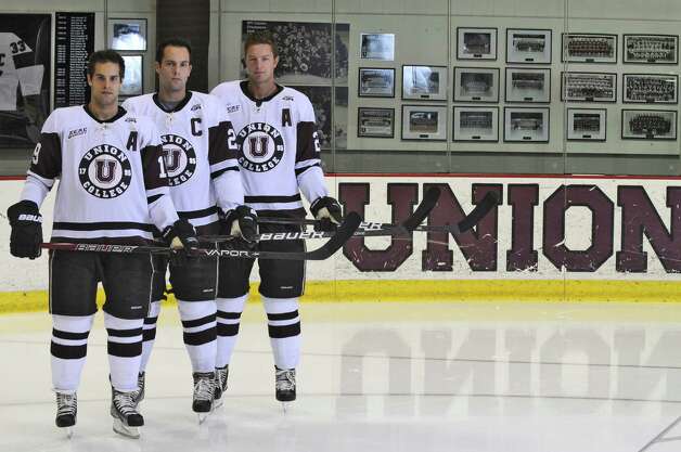
Union unveiled new jerseys at its media days. I know into which camp that I would put them. I preferred their homes from last season.

___________________________
Class of 2010
2009-10 Cornell-Harvard:
11/07/2009 Ithaca 6-3
02/19/2010 Cambridge 3-0
03/12/2010 Ithaca 5-1
03/13/2010 Ithaca 3-0
Class of 2010
2009-10 Cornell-Harvard:
11/07/2009 Ithaca 6-3
02/19/2010 Cambridge 3-0
03/12/2010 Ithaca 5-1
03/13/2010 Ithaca 3-0
Re: What makes a great/bad college hockey jersey?
Posted by: French Rage (---.packetdesign.com)
Date: October 02, 2012 05:29PM
How is that any different?
___________________________
03/23/02: Maine 4, Harvard 3
03/28/03: BU 6, Harvard 4
03/26/04: Maine 5, Harvard 4
03/26/05: UNH 3, Harvard 2
03/25/06: Maine 6, Harvard 1
03/23/02: Maine 4, Harvard 3
03/28/03: BU 6, Harvard 4
03/26/04: Maine 5, Harvard 4
03/26/05: UNH 3, Harvard 2
03/25/06: Maine 6, Harvard 1
Re: What makes a great/bad college hockey jersey?
Posted by: Aaron M. Griffin (---.altnpa.east.verizon.net)
Date: October 02, 2012 06:04PM
French Rage
How is that any different?
Not much. Mainly that the shoulder panels are now colored and have contrasting piping in black and the sleeves no longer have the garnet accent but instead have a garnet band. The only jerseys:

___________________________
Class of 2010
2009-10 Cornell-Harvard:
11/07/2009 Ithaca 6-3
02/19/2010 Cambridge 3-0
03/12/2010 Ithaca 5-1
03/13/2010 Ithaca 3-0
Class of 2010
2009-10 Cornell-Harvard:
11/07/2009 Ithaca 6-3
02/19/2010 Cambridge 3-0
03/12/2010 Ithaca 5-1
03/13/2010 Ithaca 3-0
Re: What makes a great/bad college hockey jersey?
Posted by: Jim Hyla (---.twcny.res.rr.com)
Date: October 02, 2012 08:23PM
Aaron M. Griffin
French Rage
How is that any different?
Not much. Mainly that the shoulder panels are now colored and have contrasting piping in black and the sleeves no longer have the garnet accent but instead have a garnet band. The only jerseys:
Who cares?
___________________________
"Cornell Fans Made the Timbers Tremble", Boston Globe, March/1970
Cornell lawyers stopped the candy throwing. Jan/2005
"Cornell Fans Made the Timbers Tremble", Boston Globe, March/1970
Cornell lawyers stopped the candy throwing. Jan/2005
Re: What makes a great/bad college hockey jersey?
Posted by: RichH (---.northropgrumman.com)
Date: October 02, 2012 08:56PM
Jim Hyla
Aaron M. Griffin
French Rage
How is that any different?
Not much. Mainly that the shoulder panels are now colored and have contrasting piping in black and the sleeves no longer have the garnet accent but instead have a garnet band. The only jerseys:
Who cares?
Perhaps people who read things like uni-watch do. Just because you don't find it interesting doesn't mean you have to harsh on this thread.
Also, I like how if I don't scroll all the way up to get the whole photo in my browser window, I can make the reflection of the dasher logo read "Onion"
Re: What makes a great/bad college hockey jersey?
Posted by: Jim Hyla (---.arthritishealthdoctors.com)
Date: October 03, 2012 07:12AM
RichH
Jim Hyla
Aaron M. Griffin
French Rage
How is that any different?
Not much. Mainly that the shoulder panels are now colored and have contrasting piping in black and the sleeves no longer have the garnet accent but instead have a garnet band. The only jerseys:
Who cares?
Perhaps people who read things like uni-watch do. Just because you don't find it interesting doesn't mean you have to harsh on this thread.
Also, I like how if I don't scroll all the way up to get the whole photo in my browser window, I can make the reflection of the dasher logo read "Onion"
You're right, I should have put a smiley in there. I wasn't trying to slam the idea, but rather who cares about Union. Sort of like what some schools do during the intros of players. My bad. But, now that you brought it up, how do I harsh?
___________________________
"Cornell Fans Made the Timbers Tremble", Boston Globe, March/1970
Cornell lawyers stopped the candy throwing. Jan/2005
"Cornell Fans Made the Timbers Tremble", Boston Globe, March/1970
Cornell lawyers stopped the candy throwing. Jan/2005
Re: What makes a great/bad college hockey jersey?
Posted by: RichH (---.hsd1.ct.comcast.net)
Date: October 03, 2012 09:35AM
Jim Hyla
RichH
Jim Hyla
Aaron M. Griffin
French Rage
How is that any different?
Not much. Mainly that the shoulder panels are now colored and have contrasting piping in black and the sleeves no longer have the garnet accent but instead have a garnet band. The only jerseys:
Who cares?
Perhaps people who read things like uni-watch do. Just because you don't find it interesting doesn't mean you have to harsh on this thread.
Also, I like how if I don't scroll all the way up to get the whole photo in my browser window, I can make the reflection of the dasher logo read "Onion"
You're right, I should have put a smiley in there. I wasn't trying to slam the idea, but rather who cares about Union. Sort of like what some schools do during the intros of players. My bad. But, now that you brought it up, how do I harsh?
I hear you, and no need for apologies. But the entire thread is about discussions about other teams' jerseys, so a brief discussion about Union's changes is OK, I feel.
Re: What makes a great/bad college hockey jersey?
Posted by: KeithK (---.dsl.pltn13.pacbell.net)
Date: October 03, 2012 10:59PM
My question is why bother making a change like this? I understand teams changing their jersey in an effort to pump up merchandise sales. But a minor adjustment like this won't do that. So why make changes like this (and then "unveil" them, as if anyone should really care all that much).
Re: What makes a great/bad college hockey jersey?
Posted by: RichH (---.hsd1.ct.comcast.net)
Date: October 03, 2012 11:55PM
KeithK
My question is why bother making a change like this? I understand teams changing their jersey in an effort to pump up merchandise sales. But a minor adjustment like this won't do that. So why make changes like this (and then "unveil" them, as if anyone should really care all that much).
That's a question that Clarkson fans should answer. I feel that no other school in the league does more "unveiling" events than they do. Most teams have yearly jersey changes in the ECAC without making a big deal about it...save for the RPI "black out" charity versions, but the only team to do events where they model the new unis live in Potsdam. Really, the most consistent teams in the league (since the '80s) as far as jerseys go have been Cornell and St. Lawrence.
I think.
Re: What makes a great/bad college hockey jersey?
Posted by: jtn27 (---.twcny.res.rr.com)
Date: October 04, 2012 12:37AM
KeithK
My question is why bother making a change like this? I understand teams changing their jersey in an effort to pump up merchandise sales. But a minor adjustment like this won't do that. So why make changes like this (and then "unveil" them, as if anyone should really care all that much).
I think you answered your own question: it's precisely to pump up merchandise sales. Sure, it may not be by a lot, but making a big deal out of unveiling new jerseys represents cheap (maybe even free) advertising. Just look at what the NFL did in the spring. They had weeks of build up and a huge event just to reveal new jerseys that looked exactly the same except for a Nike logo instead of a Reebok one. However, they got free media attention that probably led to an increase in jersey sales. Union is basically doing the same thing, except on a smaller scale.
___________________________
Class of 2013
Class of 2013
Re: What makes a great/bad college hockey jersey?
Posted by: css228 (---.twcny.res.rr.com)
Date: October 04, 2012 01:22AM
I would almost guarantee you, that no matter what Union does, they take a loss on producing and selling their jeresys.jtn27
KeithK
My question is why bother making a change like this? I understand teams changing their jersey in an effort to pump up merchandise sales. But a minor adjustment like this won't do that. So why make changes like this (and then "unveil" them, as if anyone should really care all that much).
I think you answered your own question: it's precisely to pump up merchandise sales. Sure, it may not be by a lot, but making a big deal out of unveiling new jerseys represents cheap (maybe even free) advertising. Just look at what the NFL did in the spring. They had weeks of build up and a huge event just to reveal new jerseys that looked exactly the same except for a Nike logo instead of a Reebok one. However, they got free media attention that probably led to an increase in jersey sales. Union is basically doing the same thing, except on a smaller scale.
Re: What makes a great/bad college hockey jersey?
Posted by: RichH (---.northropgrumman.com)
Date: October 04, 2012 12:48PM
jtn27
KeithK
My question is why bother making a change like this? I understand teams changing their jersey in an effort to pump up merchandise sales. But a minor adjustment like this won't do that. So why make changes like this (and then "unveil" them, as if anyone should really care all that much).
I think you answered your own question: it's precisely to pump up merchandise sales. Sure, it may not be by a lot, but making a big deal out of unveiling new jerseys represents cheap (maybe even free) advertising. Just look at what the NFL did in the spring. They had weeks of build up and a huge event just to reveal new jerseys that looked exactly the same except for a Nike logo instead of a Reebok one. However, they got free media attention that probably led to an increase in jersey sales. Union is basically doing the same thing, except on a smaller scale.
Another factor is vendor costs. As styles change in the hockey world in general, different styles probably are offered and discontinued. When the Penguins changed their logo in the mid-90s and added the pointy shoulder panels, a bunch of minor-league & college teams appeared with that style, for example. Athletic Departments probably have contracts with different vendors and probably shop around for the best deal. Union's new sweaters only have minor changes from last year, and I don't recognize the logo of the supplier that's on the neckline. It's probably a lowest-bidder situation, as well as a supply-demand factor in choosing the jersey blanks. Cornell's on-ice jersey has flipped from being produced by CCM to Bauer to Nike and back again several times.
Re: What makes a great/bad college hockey jersey?
Posted by: KeithK (---.external.lmco.com)
Date: October 04, 2012 02:54PM
OK, that makes sense. Make some minor changes because it saves you some money in ordering the next round of jerseys.RichH
jtn27
KeithK
My question is why bother making a change like this? I understand teams changing their jersey in an effort to pump up merchandise sales. But a minor adjustment like this won't do that. So why make changes like this (and then "unveil" them, as if anyone should really care all that much).
I think you answered your own question: it's precisely to pump up merchandise sales. Sure, it may not be by a lot, but making a big deal out of unveiling new jerseys represents cheap (maybe even free) advertising. Just look at what the NFL did in the spring. They had weeks of build up and a huge event just to reveal new jerseys that looked exactly the same except for a Nike logo instead of a Reebok one. However, they got free media attention that probably led to an increase in jersey sales. Union is basically doing the same thing, except on a smaller scale.
Another factor is vendor costs. As styles change in the hockey world in general, different styles probably are offered and discontinued. When the Penguins changed their logo in the mid-90s and added the pointy shoulder panels, a bunch of minor-league & college teams appeared with that style, for example. Athletic Departments probably have contracts with different vendors and probably shop around for the best deal. Union's new sweaters only have minor changes from last year, and I don't recognize the logo of the supplier that's on the neckline. It's probably a lowest-bidder situation, as well as a supply-demand factor in choosing the jersey blanks. Cornell's on-ice jersey has flipped from being produced by CCM to Bauer to Nike and back again several times.
I still think the "unveiling" is dumb, even given the free advertising form media attention. I remember the Red Sox unveiled a new jersey a few years ago, which only changed the ont of the road lettering or something really minor like that. It just made them look silly.
Re: What makes a great/bad college hockey jersey?
Posted by: TimV (---.hsd1.ma.comcast.net)
Date: October 04, 2012 07:59PM
RichH
I don't recognize the logo of the supplier that's on the neckline.
Looks a lot like the EA Sports Logo
___________________________
"Yo Paulie - I don't see no crowd gathering 'round you neither."
"Yo Paulie - I don't see no crowd gathering 'round you neither."
Re: What makes a great/bad college hockey jersey?
Posted by: Aaron M. Griffin (---.altnpa.east.verizon.net)
Date: October 04, 2012 08:38PM
I doubt many people on here are as anti-Union fans as I am, but owning real jerseys is one thing to their credit. They have a small fanbase that does not travel overly well, but those who do attend away games tend to wear authentic jerseys. So, I think that assuming that they would not sell the jerseys is somewhat unsubstantiated.css228
I would almost guarantee you, that no matter what Union does, they take a loss on producing and selling their jeresys.
I don't know why Cornell does not sell authentic jerseys at The Cornell Store. The replicas that it sells are poor substitutes. Most programs sell their authentic jerseys or good replicas at their campus stores. Cornell does neither. It is one of the main decisions surrounding the program and its marketing that is most foolish. I know that in a few weeks I will be able to buy a new NCAA Division I Penn State jersey directly from the Penn State store and authorized retailers downtown, why a student at Cornell cannot do the same readily is beyond me.
It is the logo of Gemini. It is a small company out of Minnesota that makes jerseys for a handful of ECAC teams and programs in other conferences. They supply Yale. I believe that they might supply RPI's jerseys too. I looked it up last season when I realized that Union and Yale had the same, non-name-brand provider.TimV
Looks a lot like the EA Sports LogoRichH
I don't recognize the logo of the supplier that's on the neckline.
___________________________
Class of 2010
2009-10 Cornell-Harvard:
11/07/2009 Ithaca 6-3
02/19/2010 Cambridge 3-0
03/12/2010 Ithaca 5-1
03/13/2010 Ithaca 3-0
Class of 2010
2009-10 Cornell-Harvard:
11/07/2009 Ithaca 6-3
02/19/2010 Cambridge 3-0
03/12/2010 Ithaca 5-1
03/13/2010 Ithaca 3-0
Re: What makes a great/bad college hockey jersey?
Posted by: Redscore (217.196.249.---)
Date: October 04, 2012 09:41PM
This is the dumbest f'ing thing on the elynah thread. Guys, let's end this stupidity and talk hockey. Drown his thread. Dont respond please
Re: What makes a great/bad college hockey jersey?
Posted by: RichH (---.hsd1.ct.comcast.net)
Date: October 04, 2012 11:52PM
Redscore
This is the dumbest f'ing thing on the elynah thread. Guys, let's end this stupidity and talk hockey. Drown his thread. Dont respond please
Or..OR! you don't have to read this thread at all and start a hockey thread yourself which you can do exactly that.
Re: What makes a great/bad college hockey jersey?
Posted by: css228 (---.twcny.res.rr.com)
Date: October 05, 2012 12:14AM
Its not unsubstantiated at all. You just wrote out my entire reasoning. They have a small fanbase. There is no way they produce and sell these in enough bulk to break even, let alone make money. There's simply not a big enough market.Aaron M. Griffin
I doubt many people on here are as anti-Union fans as I am, but owning real jerseys is one thing to their credit. They have a small fanbase that does not travel overly well, but those who do attend away games tend to wear authentic jerseys. So, I think that assuming that they would not sell the jerseys is somewhat unsubstantiated.css228
I would almost guarantee you, that no matter what Union does, they take a loss on producing and selling their jeresys.
Re: What makes a great/bad college hockey jersey?
Posted by: marty (---.sub-70-192-12.myvzw.com)
Date: October 05, 2012 10:02AM
Redscore
This is the dumbest f'ing thing on the elynah thread. Guys, let's end this stupidity and talk hockey. Drown his thread. Dont respond please
We've been over this before. It's not f'ing, its Effen.

Re: What makes a great/bad college hockey jersey?
Posted by: Aaron M. Griffin (---.altnpa.east.verizon.net)
Date: October 05, 2012 12:38PM
This is devolving quickly even for a nonsense thread.css228
Its not unsubstantiated at all. You just wrote out my entire reasoning. They have a small fanbase. There is no way they produce and sell these in enough bulk to break even, let alone make money. There's simply not a big enough market.Aaron M. Griffin
I doubt many people on here are as anti-Union fans as I am, but owning real jerseys is one thing to their credit. They have a small fanbase that does not travel overly well, but those who do attend away games tend to wear authentic jerseys. So, I think that assuming that they would not sell the jerseys is somewhat unsubstantiated.css228
I would almost guarantee you, that no matter what Union does, they take a loss on producing and selling their jeresys.
A small loyal fanbase can make production of jerseys economical if there is a guaranteed high level of market saturation of the product and low supply, so that revenues are not lost in production of jerseys that remain unsold. If they are smart about this (that's a big "if" ), they could make production of jerseys profitable. They have effectively a captive market, albeit a small one, that will buy the jerseys if they make them available. As long as there is not excessive production, they will make money considering each jersey is sold at a profit relative to production costs.
Anyways, while we are disparaging Union, let's do it regarding something more concrete:
2012-13 Union Media Guide
While sharing a conference with six Ivy League schools, the Dutchmen consistently shine brighter in the classroom.
___________________________
Class of 2010
2009-10 Cornell-Harvard:
11/07/2009 Ithaca 6-3
02/19/2010 Cambridge 3-0
03/12/2010 Ithaca 5-1
03/13/2010 Ithaca 3-0
Class of 2010
2009-10 Cornell-Harvard:
11/07/2009 Ithaca 6-3
02/19/2010 Cambridge 3-0
03/12/2010 Ithaca 5-1
03/13/2010 Ithaca 3-0
Re: What makes a great/bad college hockey jersey?
Posted by: jtn27 (---.twcny.res.rr.com)
Date: October 05, 2012 12:59PM
Aaron M. Griffin
Anyways, while we are disparaging Union, let's do it regarding something more concrete:
2012-13 Union Media Guide
While sharing a conference with six Ivy League schools, the Dutchmen consistently shine brighter in the classroom.
Is this a classroom where they teach how make up blatant lies?
___________________________
Class of 2013
Class of 2013
Re: What makes a great/bad college hockey jersey?
Posted by: marty (---.nycap.res.rr.com)
Date: October 05, 2012 01:22PM
Aaron M. Griffin
Anyways, while we are disparaging Union, let's do it regarding something more concrete:
2012-13 Union Media Guide
While sharing a conference with six Ivy League schools, the Dutchmen consistently shine brighter in the classroom.
There is certainly evidence for the claim. Read it and weep.
")
Union Ranked above Ivies
Edited 3 time(s). Last edit at 10/05/2012 01:27PM by marty.
Re: What makes a great/bad college hockey jersey?
Posted by: TimV (---.hsd1.ma.comcast.net)
Date: October 05, 2012 06:33PM
marty
Aaron M. Griffin
Anyways, while we are disparaging Union, let's do it regarding something more concrete:
2012-13 Union Media Guide
While sharing a conference with six Ivy League schools, the Dutchmen consistently shine brighter in the classroom.
There is certainly evidence for the claim. Read it and weep.
Union Ranked above Ivies
That link sent me to a story about highest salary potential among those institutions considered "Party Schools" by the Princeton review. So getting lit helps you shine brighter. I get it.

AND they almost got beat by #2 Cal Santa Barbara.

___________________________
"Yo Paulie - I don't see no crowd gathering 'round you neither."
"Yo Paulie - I don't see no crowd gathering 'round you neither."
Re: What makes a great/bad college hockey jersey?
Posted by: Josh '99 (---.nycmny.fios.verizon.net)
Date: October 05, 2012 07:03PM
Can you really put a price on going to school in Santa Barbara rather than Schenectady?TimV
marty
Aaron M. Griffin
Anyways, while we are disparaging Union, let's do it regarding something more concrete:
2012-13 Union Media Guide
While sharing a conference with six Ivy League schools, the Dutchmen consistently shine brighter in the classroom.
There is certainly evidence for the claim. Read it and weep.
Union Ranked above Ivies
That link sent me to a story about highest salary potential among those institutions considered "Party Schools" by the Princeton review. So getting lit helps you shine brighter. I get it.
AND they almost got beat by #2 Cal Santa Barbara.
Re: What makes a great/bad college hockey jersey?
Posted by: Trotsky (---.hsd1.md.comcast.net)
Date: October 05, 2012 11:09PM
Josh '99
Can you really put a price on going to school in Santa Barbara rather than Schenectady?


Re: What makes a great/bad college hockey jersey?
Posted by: RichH (---.hsd1.ct.comcast.net)
Date: October 05, 2012 11:12PM
Trotsky
Josh '99
Can you really put a price on going to school in Santa Barbara rather than Schenectady?
For me, it's less a question of the pictures you posted than the people you meet, since I've hung out in both places.
Re: What makes a great/bad college hockey jersey?
Posted by: Trotsky (---.hsd1.md.comcast.net)
Date: October 05, 2012 11:25PM
RichH
For me, it's less a question of the pictures you posted than the people you meet, since I've hung out in both places.


Re: What makes a great/bad college hockey jersey?
Posted by: marty (---.nycap.res.rr.com)
Date: October 05, 2012 11:48PM
To be fair the ranking that I linked to above was from a 2010 analysis.
Here is something more current.
You want an Onion in that Mr. Bond????
Here is something more current.
You want an Onion in that Mr. Bond????
Re: What makes a great/bad college hockey jersey?
Posted by: ursusminor (---.washdc.east.verizon.net)
Date: October 06, 2012 04:59AM
The one benefit of Union's rise and RPI's fall in recent years has been the replacement of "Troy is a dump" by "Schenectady is a dump" here. ")
I do note a place that advertises NY Pizza in the Schenectady picture. If it is authentic, that is probably one plus for Schenectady over Santa Barbara. NY pizza is one thing that I have always missed here in DC.
I do note a place that advertises NY Pizza in the Schenectady picture. If it is authentic, that is probably one plus for Schenectady over Santa Barbara. NY pizza is one thing that I have always missed here in DC.
Re: What makes a great/bad college hockey jersey?
Posted by: Trotsky (---.hsd1.md.comcast.net)
Date: October 06, 2012 01:09PM
There's an excellent NY pizza place in Frederick not more than a half mile off the C&O canal bike path.ursusminor
NY pizza is one thing that I have always missed here in DC.
Re: What makes a great/bad college hockey jersey?
Posted by: munchkin (---.hsd1.ma.comcast.net)
Date: October 06, 2012 10:16PM
Trotsky
There's an excellent NY pizza place in Frederick not more than a half mile off the C&O canal bike path.ursusminor
NY pizza is one thing that I have always missed here in DC.
It's not NY, but Vace is pretty damn good in my opinion, although my sister swears by Manny and Olga in Bethesda.
Re: What makes a great/bad college hockey jersey?
Posted by: jtwcornell91 (Moderator)
Date: October 12, 2012 08:59AM
Josh '99
Can you really put a price on going to school in Santa Barbara rather than Schenectady?TimV
marty
Aaron M. Griffin
Anyways, while we are disparaging Union, let's do it regarding something more concrete:
2012-13 Union Media Guide
While sharing a conference with six Ivy League schools, the Dutchmen consistently shine brighter in the classroom.
There is certainly evidence for the claim. Read it and weep.
Union Ranked above Ivies
That link sent me to a story about highest salary potential among those institutions considered "Party Schools" by the Princeton review. So getting lit helps you shine brighter. I get it.
AND they almost got beat by #2 Cal Santa Barbara.
Yeah, but since The Mr. Squishy Show went off the air, there's no local coverage of College Hockey in SB.
Re: What makes a great/bad college hockey jersey?
Posted by: TheMatrix (---.ccmr.cornell.edu)
Date: October 18, 2012 01:29PM
Instead of bumping an ancient thread on game worns, I'll just post this here.
With the Red-White game out of the way, last year's game worn jerseys are available for purchase, $100 each.
Only the away red jerseys are available; Bill said they didn't replace the whites for whatever reason.
The nameplates have been removed. As mentioned in the FAQ, contact Bill Reynolds (wlr5) in the Teagle Issue Room.
I picked up Miller's 16, so as far as I know, the following are still available:
5 Joakim Ryan
7 Braden Birch
10 Madison Dias
11 Vince Mihalek
14 John McCarron
15 Rodger Craig
17 Brian Ferlin
18 Armand de Swardt
20 Dustin Mowrey
21 Erik Axell
24 Kirill Gotovets
28 Joel Lowry
29 Kevin Cole
31 Omar Kanji
Re: What makes a great/bad college hockey jersey?
Posted by: ugarte (---.dyn.optonline.net)
Date: October 19, 2012 06:13PM
This remains an incredible bargain.TheMatrix
Instead of bumping an ancient thread on game worns, I'll just post this here.
With the Red-White game out of the way, last year's game worn jerseys are available for purchase, $100 each.
Only the away red jerseys are available; Bill said they didn't replace the whites for whatever reason.
The nameplates have been removed. As mentioned in the FAQ, contact Bill Reynolds (wlr5) in the Teagle Issue Room.
I picked up Miller's 16, so as far as I know, the following are still available:
5 Joakim Ryan
7 Braden Birch
10 Madison Dias
11 Vince Mihalek
14 John McCarron
15 Rodger Craig
17 Brian Ferlin
18 Armand de Swardt
20 Dustin Mowrey
21 Erik Axell
24 Kirill Gotovets
28 Joel Lowry
29 Kevin Cole
31 Omar Kanji
___________________________
quality tweets | bluesky (twitter 2) | ALAB Series podcast | Other podcasts and writing
quality tweets | bluesky (twitter 2) | ALAB Series podcast | Other podcasts and writing
Re: What makes a great/bad college hockey jersey?
Posted by: French Rage (---.hsd1.ca.comcast.net)
Date: October 20, 2012 10:41AM
ugarte
This remains an incredible bargain.TheMatrix
Instead of bumping an ancient thread on game worns, I'll just post this here.
With the Red-White game out of the way, last year's game worn jerseys are available for purchase, $100 each.
Only the away red jerseys are available; Bill said they didn't replace the whites for whatever reason.
The nameplates have been removed. As mentioned in the FAQ, contact Bill Reynolds (wlr5) in the Teagle Issue Room.
I picked up Miller's 16, so as far as I know, the following are still available:
5 Joakim Ryan
7 Braden Birch
10 Madison Dias
11 Vince Mihalek
14 John McCarron
15 Rodger Craig
17 Brian Ferlin
18 Armand de Swardt
20 Dustin Mowrey
21 Erik Axell
24 Kirill Gotovets
28 Joel Lowry
29 Kevin Cole
31 Omar Kanji
Seriously, it was $100 (or maybe even $125) when I got mine 10 years ago. No inflation!
___________________________
03/23/02: Maine 4, Harvard 3
03/28/03: BU 6, Harvard 4
03/26/04: Maine 5, Harvard 4
03/26/05: UNH 3, Harvard 2
03/25/06: Maine 6, Harvard 1
03/23/02: Maine 4, Harvard 3
03/28/03: BU 6, Harvard 4
03/26/04: Maine 5, Harvard 4
03/26/05: UNH 3, Harvard 2
03/25/06: Maine 6, Harvard 1
Re: What makes a great/bad college hockey jersey?
Posted by: Robb (---.tx.res.rr.com)
Date: December 12, 2012 03:23PM
Boo-hiss to the staff for letting someone else waltz in and pick up Ferlin's #17 jersey which my wife had reserved and PAID FOR as a Christmas present to me. Apparently when it comes to incredible bargains, you DON'T always get what you pay for. /pissed
Re: What makes a great/bad college hockey jersey?
Posted by: Swampy (---.ri.ri.cox.net)
Date: December 12, 2012 09:49PM
Robb
Boo-hiss to the staff for letting someone else waltz in and pick up Ferlin's #17 jersey which my wife had reserved and PAID FOR as a Christmas present to me. Apparently when it comes to incredible bargains, you DON'T always get what you pay for. /pissed
That sucks. You'd think they'd have the decency to get another one for you.
Re: What makes a great/bad college hockey jersey?
Posted by: jtn27 (---.twcny.res.rr.com)
Date: December 14, 2012 10:47AM
Robb
Boo-hiss to the staff for letting someone else waltz in and pick up Ferlin's #17 jersey which my wife had reserved and PAID FOR as a Christmas present to me. Apparently when it comes to incredible bargains, you DON'T always get what you pay for. /pissed
If it's the home jersey from this year, you're probably better off. At the last home game, a few of us noticed that Ferlin's jersey had a giant blood stain on the front. It looked to be a few games old and impervious to detergent.
___________________________
Class of 2013
Class of 2013
Re: What makes a great/bad college hockey jersey?
Posted by: Trotsky (---.dc.dc.cox.net)
Date: December 14, 2012 11:02AM
jtn27
Robb
Boo-hiss to the staff for letting someone else waltz in and pick up Ferlin's #17 jersey which my wife had reserved and PAID FOR as a Christmas present to me. Apparently when it comes to incredible bargains, you DON'T always get what you pay for. /pissed
If it's the home jersey from this year, you're probably better off. At the last home game, a few of us noticed that Ferlin's jersey had a giant blood stain on the front. It looked to be a few games old and impervious to detergent.
That's what gives it character.
Re: What makes a great/bad college hockey jersey?
Posted by: Josh '99 (---.nycmny.fios.verizon.net)
Date: December 14, 2012 01:59PM
Seriously! A giant blood stain is WAAAAAY better than puck marks.Trotsky
jtn27
Robb
Boo-hiss to the staff for letting someone else waltz in and pick up Ferlin's #17 jersey which my wife had reserved and PAID FOR as a Christmas present to me. Apparently when it comes to incredible bargains, you DON'T always get what you pay for. /pissed
If it's the home jersey from this year, you're probably better off. At the last home game, a few of us noticed that Ferlin's jersey had a giant blood stain on the front. It looked to be a few games old and impervious to detergent.
That's what gives it character.
(Sorry to rub it in, Robb.)
Re: What makes a great/bad college hockey jersey?
Posted by: Robb (---.tx.res.rr.com)
Date: December 26, 2012 10:02AM
Well, it turns out that they did (Gotovets's #24), but my wife didn't tell me that part so she could surprise me with THAT one. Good wife!Swampy
Robb
Boo-hiss to the staff for letting someone else waltz in and pick up Ferlin's #17 jersey which my wife had reserved and PAID FOR as a Christmas present to me. Apparently when it comes to incredible bargains, you DON'T always get what you pay for. /pissed
That sucks. You'd think they'd have the decency to get another one for you.
The big surprise, though, was that #17 turned up at my billing address. So apparently they were competent enough to do the right thing - they just weren't competent enough to know that they were that competent!
(and yes, we will be paying for or returning the #24 or I wouldn't be posting about it here!)
If I decide to return it, I'll post on here in case someone wants to buy it directly from me instead.
Re: What makes a great/bad college hockey jersey?
Posted by: jtn27 (---.nycmny.fios.verizon.net)
Date: December 27, 2012 06:37PM
Robb
Well, it turns out that they did (Gotovets's #24), but my wife didn't tell me that part so she could surprise me with THAT one. Good wife!Swampy
Robb
Boo-hiss to the staff for letting someone else waltz in and pick up Ferlin's #17 jersey which my wife had reserved and PAID FOR as a Christmas present to me. Apparently when it comes to incredible bargains, you DON'T always get what you pay for. /pissed
That sucks. You'd think they'd have the decency to get another one for you.
The big surprise, though, was that #17 turned up at my billing address. So apparently they were competent enough to do the right thing - they just weren't competent enough to know that they were that competent!
(and yes, we will be paying for or returning the #24 or I wouldn't be posting about it here!)
If I decide to return it, I'll post on here in case someone wants to buy it directly from me instead.
Were they able to get the blood stain off Ferlin's jersey before they mailed it?
___________________________
Class of 2013
Class of 2013
Re: What makes a great/bad college hockey jersey?
Posted by: Ben (---.cable.mindspring.com)
Date: December 28, 2012 01:23AM
The blood stain is on this year's jersey, Robb got last year's.jtn27
Robb
Well, it turns out that they did (Gotovets's #24), but my wife didn't tell me that part so she could surprise me with THAT one. Good wife!
The big surprise, though, was that #17 turned up at my billing address. So apparently they were competent enough to do the right thing - they just weren't competent enough to know that they were that competent!
(and yes, we will be paying for or returning the #24 or I wouldn't be posting about it here!)
If I decide to return it, I'll post on here in case someone wants to buy it directly from me instead.
Were they able to get the blood stain off Ferlin's jersey before they mailed it?
Re: What makes a great/bad college hockey jersey?
Posted by: Robb (---.tx.res.rr.com)
Date: December 28, 2012 01:43AM
More specifically, last year's away (red) jersey, so a bloodstain would barely show anyway.Ben
The blood stain is on this year's jersey, Robb got last year's.jtn27
Robb
Well, it turns out that they did (Gotovets's #24), but my wife didn't tell me that part so she could surprise me with THAT one. Good wife!
The big surprise, though, was that #17 turned up at my billing address. So apparently they were competent enough to do the right thing - they just weren't competent enough to know that they were that competent!
(and yes, we will be paying for or returning the #24 or I wouldn't be posting about it here!)
If I decide to return it, I'll post on here in case someone wants to buy it directly from me instead.
Were they able to get the blood stain off Ferlin's jersey before they mailed it?
Re: What makes a great/bad college hockey jersey?
Posted by: css228 (---.hsd1.pa.comcast.net)
Date: December 28, 2012 02:32PM
This is what eLynah devolves to when we have no hockey. Can't wait for 4:30 today.Robb
More specifically, last year's away (red) jersey, so a bloodstain would barely show anyway.Ben
The blood stain is on this year's jersey, Robb got last year's.jtn27
Robb
Well, it turns out that they did (Gotovets's #24), but my wife didn't tell me that part so she could surprise me with THAT one. Good wife!
The big surprise, though, was that #17 turned up at my billing address. So apparently they were competent enough to do the right thing - they just weren't competent enough to know that they were that competent!
(and yes, we will be paying for or returning the #24 or I wouldn't be posting about it here!)
If I decide to return it, I'll post on here in case someone wants to buy it directly from me instead.
Were they able to get the blood stain off Ferlin's jersey before they mailed it?
Re: What makes a great/bad college hockey jersey?
Posted by: ugarte (---.dyn.optonline.net)
Date: December 29, 2012 10:40AM
When eLF devolves we don't talk about bloody jerseys; we talk about bloody revolution to restore the Constitution.css228
This is what eLynah devolves to when we have no hockey. Can't wait for 4:30 today.Robb
More specifically, last year's away (red) jersey, so a bloodstain would barely show anyway.Ben
The blood stain is on this year's jersey, Robb got last year's.jtn27
Robb
Well, it turns out that they did (Gotovets's #24), but my wife didn't tell me that part so she could surprise me with THAT one. Good wife!
The big surprise, though, was that #17 turned up at my billing address. So apparently they were competent enough to do the right thing - they just weren't competent enough to know that they were that competent!
(and yes, we will be paying for or returning the #24 or I wouldn't be posting about it here!)
If I decide to return it, I'll post on here in case someone wants to buy it directly from me instead.
Were they able to get the blood stain off Ferlin's jersey before they mailed it?
___________________________
quality tweets | bluesky (twitter 2) | ALAB Series podcast | Other podcasts and writing
quality tweets | bluesky (twitter 2) | ALAB Series podcast | Other podcasts and writing
Sorry, only registered users may post in this forum.